Momentum That Really Can Beat the Market
Ever wondered how to beat SP 500? Beating the S&P 500 by a factor of two sounds like clickbait – yet historically, certain disciplined momentum strategies have indeed outperformed broad market indices by wide margins over long horizons. This article breaks down how a systematic momentum approach to stock selection works, why it can generate excess returns, and what hidden risks and pitfalls you must control if you want any chance of achieving such outsized results. Instead of secret tips or hunches, you will see clear rules, holding periods, and portfolio management techniques that turn “buy what’s going up” into a repeatable process.
Why Momentum Can Ignore Fundamentals and Still Work
In practice, markets often behave less like perfectly efficient calculators of fundamental value and more like social systems driven by crowd behavior, career risk, and slow information diffusion. When a stock starts to move strongly in one direction, investors who are underexposed feel pressure to “catch up,” while short‑sellers rush to cover, adding fuel to the move. This creates a tendency for price trends to persist over weeks and months even when traditional fundamentals (P/E, book value, macro data) look stretched or ambiguous. Instead of trying to process every balance sheet ratio, macro indicator, and management comment, a momentum‑based strategy accepts that the current price already aggregates thousands of microscopic judgments and focuses on a single, observable feature: recent relative performance. By systematically buying the strongest names and cutting the weakest, the investor attempts to ride these behavioral and structural trends, outsourcing the messy fundamental debate to the market itself and saving enormous analytical time while still capturing a powerful return driver. 
Beating the market does not always require complex models or deep fundamental research. A disciplined, rules-based momentum strategy can exploit one of the most persistent anomalies in finance: the tendency of strong stocks to keep performing well—at least for a while.
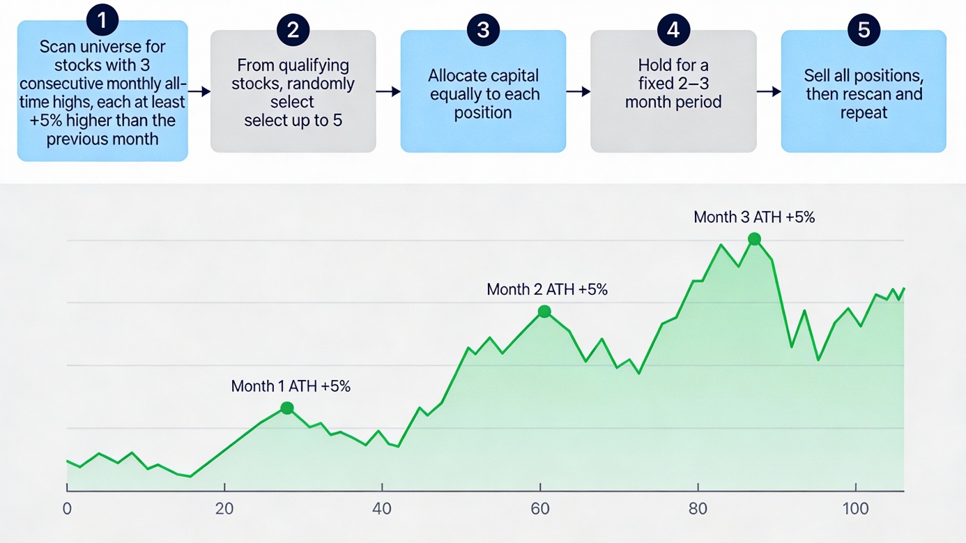
The Entry Filter: Three-Month, +5% All-Time-High Pattern
The strategy begins with a strict, repeatable entry rule. Each month, the stock universe is scanned for companies that have achieved a new all‑time high in each of the previous three consecutive months, and crucially, each month’s peak must be at least 5% higher than the last.
In mathematical terms: if the ATH in month 1 is H₁, then month 2’s ATH must be ≥ 1.05 × H₁, and month 3’s ATH must be ≥ 1.05 × H₂.
Why this “staircase” works:
- It captures only stocks where buying pressure is both sustained and accelerating.
- It filters out random spikes and weak breakouts that barely clear prior highs.
- It indicates that institutional money is building positions, not just retail enthusiasm.
- This three‑month, +5% rhythm separates real momentum from noise.
Portfolio Construction: Random Selection and Equal Weight
From the cohort of stocks meeting the ATH criteria, the strategy randomly selects up to five names (or less if there are no 5 meeting the criteria) and assigns each an equal dollar allocation.
Why randomness?
- Avoids unconscious cherry‑picking based on gut feel.
- Reduces accidental concentration in a single sector or theme.
- Ensures performance flows from the rule itself, not from lucky discretionary picks.
Why equal weighting?
- Each trade gets the same risk budget; no single name can wreck the portfolio.
- You automatically participate in winners rather than underweighting future best performers.
- Position sizing becomes transparent and reproducible.
Tax Treatment: 19% on Every Batch
For simplicity reasons, tax is deducted directly at the batch level: any win and any loss are calculated as decreased by tax at 19%. In practice, that means the net PnL from each closed batch is multiplied by 0.81 before being added to or subtracted from equity. The amount available for the next purchase is therefore already tax‑adjusted, and the entire equity curve you see reflects after‑tax results under this symmetric assumption.
This is a modeling choice: it assumes gains are taxed and losses provide an equivalent tax benefit immediately, which simplifies implementation while still penalizing turnover and making the path more realistic than a purely pre‑tax simulation.
Benchmark
To judge performance fairly, all results are compared against a simple SP500 buy‑and‑hold benchmark. The benchmark starts from the same initial capital of $100,000.00 and compounds yearly SP500 total returns without any tax drag during the holding period. Only at the very end of the full test horizon is a 19% tax applied once to the benchmark’s total unrealized gain, mimicking a long‑term investor who holds an index ETF for years and realizes capital gains only upon final sale.
Holding Period: Short-Term Discipline
Each batch of up to five stocks is held for a fixed short‑term window—typically two or three months—bought on the first trading day of month m and sold on the first trading day of month m+2 (or m+3).
Why short holding periods matter:
- Momentum tends to decay after a few months; this window captures the trend before mean reversion sets in.
- Fixed exit rules remove emotional decisions about when to take profits or cut winners.
- The frequency is aggressive enough to keep the portfolio refreshed into current strongest names, but not so frequent that transaction costs dominate.
No Overlapping Positions: One Batch at a Time
A critical operational rule: no new positions are opened while a batch is still active. Whenever at least one stock passes the filter, 100% of equity is deployed across up to five qualifying names in that batch. The portfolio is flat only when no stock in the universe meets the entry criteria at all. After the holding period ends, the entire batch is liquidated before any new trades are considered.
Benefits:
- Each batch has a measurable start equity, end equity, and return.
- You avoid overlapping signals that might be highly correlated.
- The portfolio is either “in” or “out”—no messy half-positions.
- If no new stocks meet the +5% ATH criteria after a batch is closed, the strategy does not open a new batch for that cycle and remains flat until a new qualifying set appears.
The Sell-and-Rescan Loop
After the holding period expires:
- Scan the universe for stocks with the three‑month, +5% ATH pattern.
- If qualified names exist, randomly choose up to five and allocate capital equally.
- Hold for 2 or 3 months, then exit and measure the batch return.
- Repeat the cycle, rotating the portfolio into the currently strongest trends.
This loop ensures the strategy continuously adapts to changing market leadership rather than clinging to names whose momentum has faded.
Risk Management Built In
The framework includes natural safeguards:
- Price validity checks: Only stocks with valid, positive prices at entry and exit are traded.
- Position sizing discipline: With at most five equal positions, individual drawdowns are bounded.
- Transparency: Every signal is rules‑based and reproducible.
This approach distills momentum investing to its essence: identify stocks where the market itself is showing the strongest conviction through price, then ride that conviction with simple, disciplined mechanics. No complex forecasting models. No fundamental deep dives. Just systematic trend-following backed by one of finance’s most persistent anomalies.
Rule | Details |
Entry filter | 3 consecutive monthly ATHs, each ≥ 5% higher than the last |
Selection | Randomly pick up to 5 qualifying stocks |
Position sizing | Equal dollar allocation to each position |
Entry | First trading day of month m |
Exit | First trading day of month m+2 (or m+3 variant) |
No overlap | No new batch opens until current batch fully exits |
Between batches | If no stocks qualify, hold no positions for that cycle |
Risk control | Max 5 equal positions, price validity checks |
Note: SP500 and individual stock data are pulled from Yahoo Finance and might not be 100% accurate, due to corporate actions, data vendor issues, or differences in dividend adjustment methods.
Data Preparation
Full sample period
The results did not come from a toy backtest or hand‑picked examples. Over the full sample from April 2000 to December 2025, the S&P 500 universe was rebuilt year by year to reflect the actual companies available to investors at each point in time.
Systematic ATH detection
For every stock and every calendar year in this 25‑year window, all‑time highs were systematically identified so the three‑month, +5% ATH “staircase” pattern could be measured mechanically rather than inferred from a few famous winners.
Stressful market regimes covered
This range deliberately spans multiple stress regimes—including the dot‑com bust, the global financial crisis, the 2020 pandemic crash, and the rate‑hike cycle of the 2020s—so the strategy is tested across very different market environments.

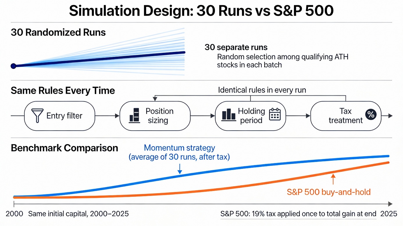
Simulation Design
To avoid flattering the strategy with one lucky path, the simulation was run 30 separate times using random selection among the qualifying ATH stocks in each batch. Every run followed the same rules—entry filter, position sizing, holding period, tax treatment—and the performance shown is the average across all 30 runs, not the single best outcome. This makes the results more representative of what a real investor might experience when following the process over many cycles. Finally, the strategy was evaluated against a broad, realistic benchmark: a buy‑and‑hold investment in the S&P 500, starting with the same initial capital and compounding index returns over the 2000–2025 horizon, with a 19% tax applied once to the total gain at the end to provide a clean after‑tax comparison between systematic momentum and the broad market index.
Results
Metric | Strategy | SP500 | Excess |
Average total return over runs | 1268.79% | 503.96% (100k → 603,957.51) | 764.83% |
Worst / best total return across runs | 720.23% / 1857.81% | – | – |
Average CAGR across runs | 11.09% per year | 8.35% per year | 2.74% per year |
Average yearly PnL over all years & runs | 50,751.41 $ | 24,886.79 $ | 25,864.62 $ |
Average final equity over runs | 1,368,785.21 $ | 603,957.51 $ | 764,827.70 $ |
Worst (max) drawdown over all years & runs | -25.08% | -47.12% | 22.04 percentage points (shallower) |
These results show a very strong long-term edge for the strategy, with clearly higher returns and much smaller worst drawdowns than the S&P 500.
Long-term performance
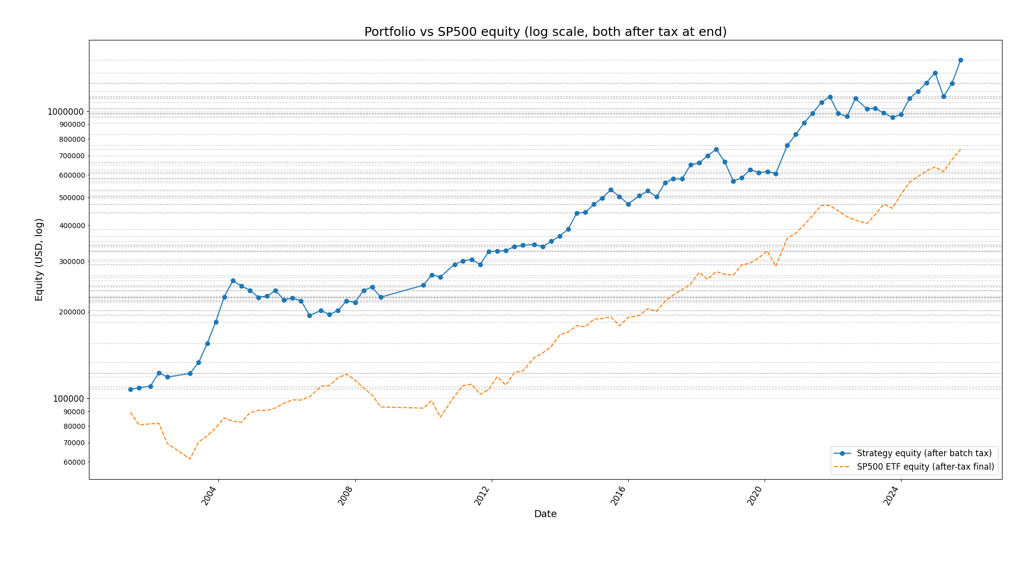
Over the full 2001‑04 to 2025‑12 period, the average run turned 100,000 $ into about 1,368,785 $, an average total return of roughly 1,269%. The highlighted run finished even higher, at around 1,505,783 $ (+1,406%), showing how strongly some individual paths compounded under the same rules.
Compounding versus S&P 500
On a compounding basis, the strategy delivered an average CAGR of about 11.1% per year, versus roughly 8.4% for the S&P 500 over the same horizon. This gap also appears in annual behavior: the average yearly return was about 12.2% for the strategy versus 9.8% for the index, for an average yearly excess of roughly 2.4 percentage points.
Profit generation
In dollar terms, the strategy produced on average about 50,751 $ of yearly PnL, compared with about 24,887 $ for the S&P 500, implying an incremental annual profit of roughly 25,865 $. Even though the S&P 500 itself compounded by about 622% over the full period, the strategy’s higher CAGR led to far larger ending balances.
Risk and drawdowns
The strategy’s worst observed drawdown across all years and runs was around ‑25.1%, much smaller than the S&P 500’s worst drawdown of about ‑47.1%. This difference is clearly visible on the equity chart: the strategy’s line rises smoothly with only shallow, brief dips, while the S&P 500 line shows deep, violent drawdowns during major crises.
The strategy stays invested through bear markets and can get hit hard in one‑off crashes, but across 2001–2025 it is clearly less dangerous than SP500 in deep drawdowns while still compounding much faster.
Bear market behaviour

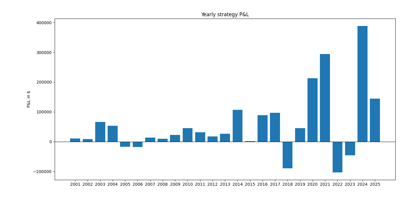
Looking at the big stress years:
- 2001–2002 (dot‑com bust)
SP500: about −10% and −22% in 2001–2002 with max DD around −29% and −33%.
Strategy: small positive or mid‑single‑digit returns in those years in most runs (e.g. +5–12%), so it largely sidesteps the early‑2000s bear and keeps compounding while the index is down. - 2008 (GFC)
SP500: −36% with max DD around −47%.
Strategy: around +4% in 2008, with intra‑year DD around −8%.
That is a huge safety advantage: the strategy still earns a small gain while SP500 loses more than a third of its value and nearly halves peak‑to‑trough. - 2018 mini‑bear / Q4 crash
SP500: about −5% with roughly −19% max DD.
Strategy: strongly negative year (−10 to −17% depending on run) with max DD of around −20 to −25%, so worse than SP500 in that specific episode. - 2022 bear
SP500: −18.7% with max DD about −24.5%.
Strategy: around −9 to −10% with max DD about −8%; it loses, but roughly half the loss of SP500 and with much shallower drawdown.
Across all runs and years, the reported worst (max) drawdown is about −25.1% for the strategy vs −47.1% for SP500, which means even in the worst simulated year or run the strategy never experiences a 50% crash like the index does.
Safety profile
- Average max drawdown over all years and runs:
Strategy: around −4.5% (per‑year peak‑to‑trough).
SP500: around −15.5%. - Worst max DD over all years and runs:
Strategy: −25.08%
SP500: −47.12%.
This means:
- Typical annual drawdowns are about three times smaller than the index.
- Even in the worst case across 30 random universes, the strategy’s deepest hole is about half as deep as SP500’s.
So for someone focused on capital protection, the strategy offers significantly shallower and less frequent large drawdowns, especially in the two classical bears (2000–02, 2008) and the 2022 bear.
Return vs risk trade‑off
Over 2001‑04 to 2025‑12 with 30 runs:
- Average total return (strategy): ≈ 1269%
- SP500 total return: ≈ 622% (from 100,000 to about 722,000 pre‑tax; ≈604,000 after tax in one run).
Average CAGR across runs:
- Strategy: 11.09% per year
- SP500: 8.35% per year
- Excess: +2.74% per year.
So you get roughly 2.5–3 percentage points higher annual compound return with much lower worst‑case and average drawdowns, except for some “growth scare” episodes like 2018 where the strategy underperforms.
Bottom line for bear markets & safety
- In big, classic bear markets (dot‑com, GFC, 2022), the strategy is substantially safer: much smaller losses, sometimes still positive while SP500 is deeply negative.
- The tail risk is significantly lower (max DD −25% vs −47%), which is a major safety improvement for a long‑only equity strategy.
- The price you pay is occasional ugly years like 2018 and some runs where you lag the index in strong rebounds, but overall the return‑per‑unit‑drawdown looks much better than SP500.
Sample runs — best vs. worst-case scenerio
Identifying best and worst runs
- The multi-run summary states: “Worst best total return strategy 720.23 1857.81,” meaning the weakest run delivered a total return of about 720% and the strongest about 1,858% over the 2001‑04 to 2025‑12 period.
- In other words, across 30 runs, final equity on 100,000 $ ranged roughly from 820,000–860,000 $ for the weakest path to about 1.9–2.0 million $ for the strongest.
Best run (highest total return)
Year | Strategy return | Strategy PnL ($) | Strategy max DD | SP500 return | SP500 PnL ($) | SP500 max DD | Excess return |
2001 | 7.94% | 7,935.50 | 0.00% | -10.13% | -10,131.57 | -28.81% | 18.07% |
2002 | 5.59% | 6,030.06 | -5.23% | -22.42% | -20,148.05 | -32.97% | 28.01% |
2003 | 60.87% | 69,369.20 | 0.00% | 24.18% | 16,861.37 | -13.73% | 36.68% |
2004 | 33.24% | 60,942.19 | -7.41% | 10.75% | 9,305.58 | -7.53% | 22.49% |
2005 | 9.43% | 23,023.27 | 0.00% | 5.32% | 5,105.96 | -6.96% | 4.10% |
2006 | -14.36% | -38,379.03 | -17.64% | 13.84% | 13,980.35 | -7.59% | -28.20% |
2007 | 50.39% | 115,353.84 | 0.00% | 5.33% | 6,130.58 | -9.92% | 45.06% |
2008 | 4.26% | 14,679.59 | -7.77% | -36.24% | -43,884.26 | -47.12% | 40.50% |
2009 | 10.05% | 36,064.90 | 0.00% | 22.65% | 17,493.95 | -27.13% | -12.61% |
2010 | 15.55% | 61,444.98 | -3.92% | 13.14% | 12,442.98 | -15.70% | 2.42% |
2011 | 10.28% | 46,938.26 | -5.41% | 0.85% | 913.44 | -18.61% | 9.43% |
2012 | 3.54% | 17,816.93 | -1.18% | 14.17% | 15,314.48 | -9.69% | -10.63% |
2013 | 8.67% | 45,190.40 | -4.31% | 29.00% | 35,783.34 | -5.55% | -20.33% |
2014 | 27.51% | 155,791.38 | -0.56% | 14.56% | 23,177.63 | -7.27% | 12.94% |
2015 | -2.96% | -21,407.58 | -12.06% | 1.29% | 2,349.41 | -11.91% | -4.25% |
2016 | 22.98% | 161,008.82 | -1.26% | 13.59% | 25,092.24 | -9.19% | 9.39% |
2017 | 18.93% | 163,179.43 | -0.56% | 20.78% | 43,596.77 | -2.61% | -1.85% |
2018 | -16.77% | -171,865.15 | -25.08% | -5.25% | -13,295.46 | -19.35% | -11.52% |
2019 | 9.81% | 83,710.29 | -0.85% | 31.09% | 74,637.55 | -6.62% | -21.28% |
2020 | 29.92% | 280,276.05 | 0.00% | 17.24% | 54,243.94 | -33.72% | 12.68% |
2021 | 33.14% | 403,311.88 | 0.00% | 30.51% | 112,556.05 | -5.11% | 2.63% |
2022 | -9.35% | -151,451.25 | -7.86% | -18.65% | -89,787.28 | -24.50% | 9.30% |
2023 | -10.32% | -151,639.04 | -12.45% | 26.71% | 104,630.43 | -9.97% | -37.03% |
2024 | 37.58% | 495,059.90 | 0.00% | 25.59% | 127,017.42 | -8.41% | 11.99% |
2025 | 3.64% | 65,988.33 | 0.00% | 15.85% | 98,782.92 | -18.76% | -12.21% |
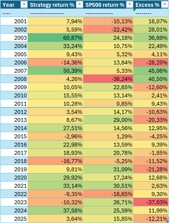
Figure 1 Best run heatmap
Compound performance over full period (after tax)
- Strategy (batch‑taxed): 1778.37% total, 100,000.00 → 1,878,373.13 (gain 1,778,373.13 $)
- SP500 ETF (tax at end): 503.96% total, 100,000.00 → 603,957.51 (gain 503,957.51 $, pre‑tax gain 622,169.77 $)
- Excess after tax: 1274.42% total, 1,274,415.61 $
Worst run (lowest total return)
Year | Strategy return | Strategy PnL ($) | Strategy max DD | SP500 return | SP500 PnL ($) | SP500 max DD | Excess return |
2001 | -1.00% | -1,000.67 | -1.32% | -10.13% | -10,131.57 | -28.81% | 9.13% |
2002 | 7.35% | 7,275.05 | -3.64% | -22.42% | -20,148.05 | -32.97% | 29.77% |
2003 | 49.79% | 52,909.94 | 0.00% | 24.18% | 16,861.37 | -13.73% | 25.60% |
2004 | 1.20% | 1,910.12 | -7.41% | 10.75% | 9,305.58 | -7.53% | -9.55% |
2005 | 11.98% | 19,295.34 | 0.00% | 5.32% | 5,105.96 | -6.96% | 6.65% |
2006 | -13.88% | -25,038.24 | -16.02% | 13.84% | 13,980.35 | -7.59% | -27.72% |
2007 | 16.43% | 25,520.83 | -4.38% | 5.33% | 6,130.58 | -9.92% | 11.10% |
2008 | 4.26% | 7,712.24 | -7.77% | -36.24% | -43,884.26 | -47.12% | 40.50% |
2009 | 10.05% | 18,947.48 | 0.00% | 22.65% | 17,493.95 | -27.13% | -12.61% |
2010 | 16.13% | 33,466.28 | -3.44% | 13.14% | 12,442.98 | -15.70% | 2.99% |
2011 | 12.23% | 29,469.33 | -4.18% | 0.85% | 913.44 | -18.61% | 11.38% |
2012 | 2.55% | 6,890.99 | -2.13% | 14.17% | 15,314.48 | -9.69% | -11.62% |
2013 | 9.37% | 25,981.90 | -4.48% | 29.00% | 35,783.34 | -5.55% | -19.63% |
2014 | 30.92% | 93,777.83 | 0.00% | 14.56% | 23,177.63 | -7.27% | 16.35% |
2015 | -6.36% | -25,260.60 | -12.50% | 1.29% | 2,349.41 | -11.91% | -7.65% |
2016 | 25.88% | 96,224.76 | 0.00% | 13.59% | 25,092.24 | -9.19% | 12.29% |
2017 | 16.23% | 75,957.67 | -0.54% | 20.78% | 43,596.77 | -2.61% | -4.55% |
2018 | -11.55% | -62,850.49 | -19.88% | -5.25% | -13,295.46 | -19.35% | -6.31% |
2019 | 0.62% | 2,981.07 | -9.15% | 31.09% | 74,637.55 | -6.62% | -30.47% |
2020 | 28.57% | 138,312.22 | 0.00% | 17.24% | 54,243.94 | -33.72% | 11.33% |
2021 | 24.00% | 149,418.41 | -0.06% | 30.51% | 112,556.05 | -5.11% | -6.50% |
2022 | -9.22% | -71,165.65 | -7.86% | -18.65% | -89,787.28 | -24.50% | 9.43% |
2023 | -4.81% | -33,727.62 | -7.07% | 26.71% | 104,630.43 | -9.97% | -31.52% |
2024 | 18.65% | 124,402.24 | 0.00% | 25.59% | 127,017.42 | -8.41% | -6.94% |
2025 | 3.64% | 28,814.99 | 0.00% | 15.85% | 98,782.92 | -18.76% | -12.21% |

Best run: character and risk
- The best run compounds capital from 100,000 $ to close to 2 million $, implying a very high realized CAGR and frequent periods of strong positive momentum, especially in years like 2003, 2007, 2014, 2020 and 2024.
- Despite these aggressive gains, the strategy still avoids catastrophic losses: the global worst drawdown across all runs is about ‑25%, far smaller than the S&P 500’s worst drawdown of roughly ‑47% over the same window.
Worst run: character and risk
- The worst run, with around 720% total return, still turns 100,000 $ into more than 800,000 $, which is very strong in absolute terms but clearly lags the run average (about 1.37 million $) and the top paths.
- This weaker path likely loads into more of the “bad luck” sequences: entering just before local tops (for instance around 2006, 2015, 2018, 2022), and participating less in the biggest upside batches, while still sharing the same rules, tax treatment and risk limits.
Comparison versus S&P 500
- Even the worst run comfortably beats buy‑and‑hold SPY, which finishes near 604,000 $ after tax (about 503% total return) over the same period.
- The best run outperforms SPY by more than 1.3 million $ of after‑tax wealth, illustrating how much path‑dependent upside the ATH pattern can create when randomization happens to align with the biggest multiyear winners.
What this says about robustness
- The wide spread between ~720% and ~1,858% shows meaningful path dependence, but all 30 implementations remain strongly profitable and superior to the benchmark, which points to a robust underlying edge rather than a single overfit configuration.
- At the same time, the gap between the worst and best runs underscores that realized outcomes in live trading will depend heavily on which specific tickers are selected each month and how they line up with future crises and bull runs, so expectations should be framed as a range rather than a point estimate.
Sample trades
month_ref | ticker | buy_date | sell_date | buy_price | sell_price | shares | pnl_dollar | trade_return_pct |
2001-04 | NVR | 2001-04-02 | 2001-06-01 | 163.50 | 171.50 | 122.32 | 978.59 | 4.89 |
2001-04 | MAT | 2001-04-02 | 2001-06-01 | 17.60 | 17.80 | 1,136.36 | 227.27 | 1.14 |
2001-04 | SLM | 2001-04-02 | 2001-06-01 | 8.65 | 8.34 | 2,312.40 | -716.26 | -3.58 |
2001-04 | MO | 2001-04-02 | 2001-06-01 | 47.70 | 51.60 | 419.29 | 1,635.22 | 8.18 |
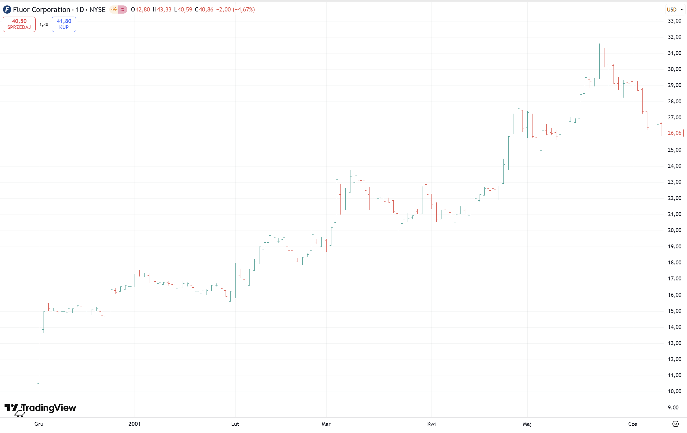
2001-04 | FLR | 2001-04-02 | 2001-06-01 | 21.85 | 29.27 | 915.33 | 6,791.76 | 33.96 |
2001-07 | PRGO | 2001-07-02 | 2001-09-04 | 16.58 | 16.14 | 1,293.39 | -569.09 | -2.65 |
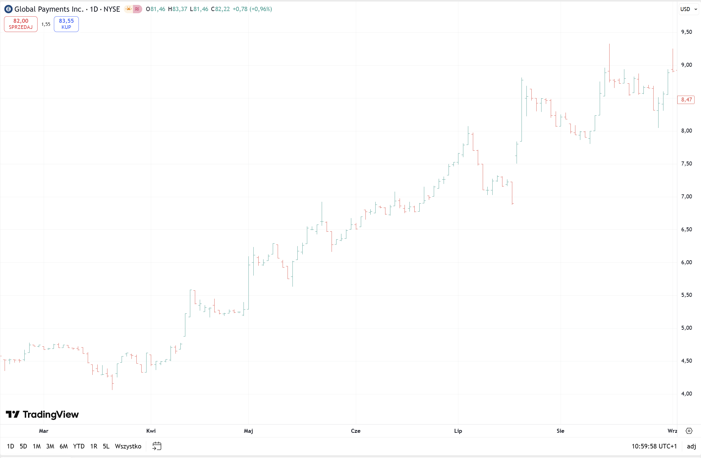
2001-07 | GPN | 2001-07-02 | 2001-09-04 | 7.53 | 8.94 | 2,849.77 | 4,025.29 | 18.77 |
2001-07 | FICO | 2001-07-02 | 2001-09-04 | 27.67 | 27.00 | 775.10 | -516.74 | -2.41 |
2001-07 | UDR | 2001-07-02 | 2001-09-04 | 14.25 | 14.45 | 1,504.88 | 300.97 | 1.40 |
2001-07 | KMX | 2001-07-02 | 2001-09-04 | 7.95 | 7.40 | 2,697.42 | -1,483.58 | -6.92 |
2001-11 | BALL | 2001-11-01 | 2002-01-02 | 3.86 | 4.42 | 5,630.21 | 3,131.81 | 14.41 |
2001-11 | BIO | 2001-11-01 | 2002-01-02 | 31.25 | 31.25 | 695.33 | 0.00 | 0.00 |
2001-11 | GD | 2001-11-01 | 2002-01-02 | 40.75 | 39.75 | 533.23 | -533.23 | -2.45 |
2001-11 | LMT | 2001-11-01 | 2002-01-02 | 48.95 | 46.15 | 443.90 | -1,242.93 | -5.72 |
2001-11 | WTW | 2001-11-01 | 2002-01-02 | 61.72 | 62.38 | 352.05 | 233.14 | 1.07 |
2002-02 | PFG | 2002-02-01 | 2002-04-01 | 25.15 | 25.35 | 1,457.02 | 291.41 | 0.80 |
2002-02 | SIG | 2002-02-01 | 2002-04-01 | 28.71 | 33.97 | 1,276.21 | 6,704.34 | 18.30 |
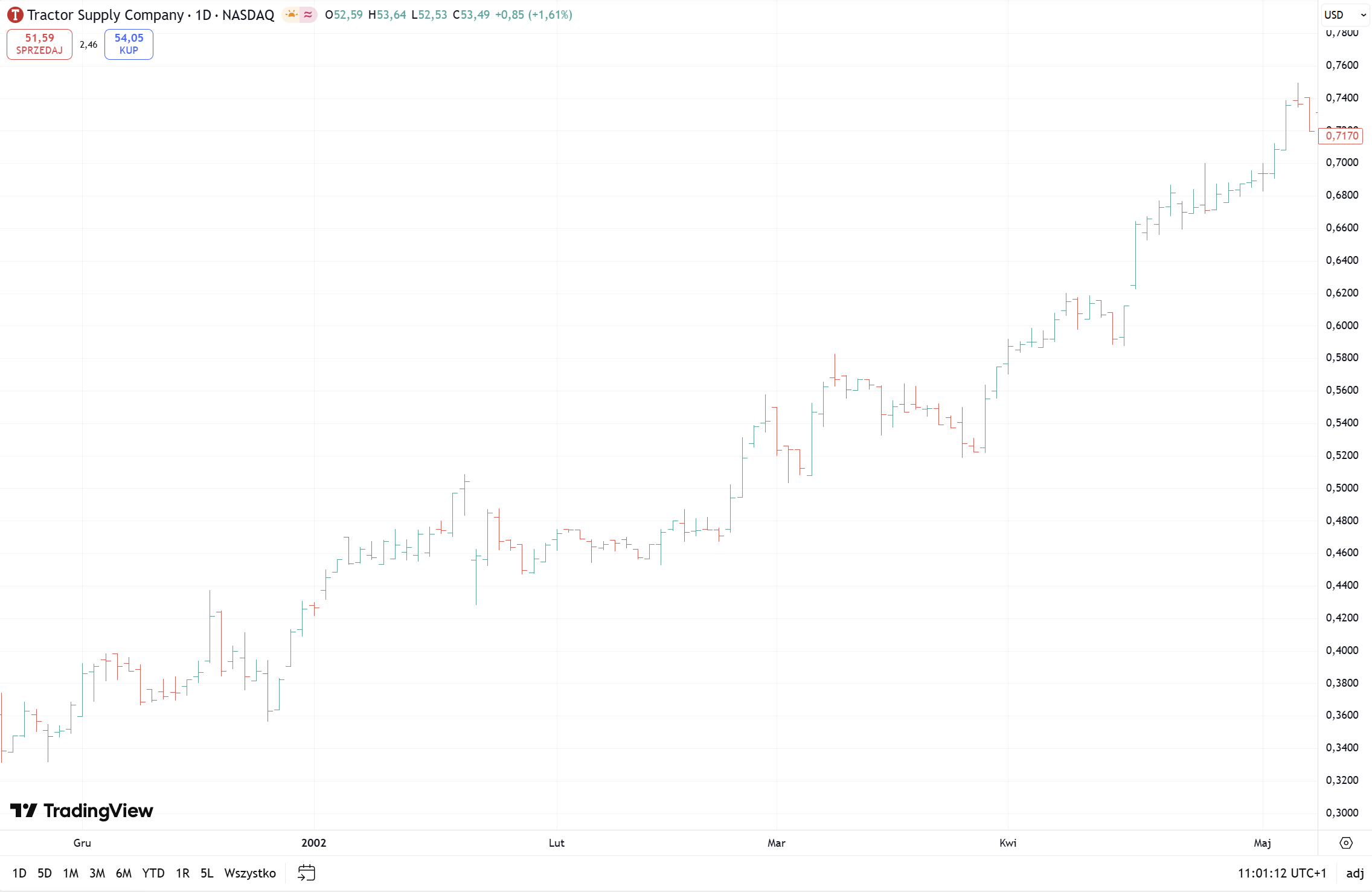
2002-02 | TSCO | 2002-02-01 | 2002-04-01 | 0.47 | 0.58 | 78,236.75 | 8,488.69 | 23.17 |
2002-05 | NVR | 2002-05-01 | 2002-07-01 | 368.25 | 325.00 | 66.52 | -2,876.87 | -11.74 |
2002-05 | PENN | 2002-05-01 | 2002-07-01 | 2.18 | 2.05 | 11,259.15 | -1,380.99 | -5.64 |
How to trade this strategy live
- End of each month: find qualifying stocks
- For every stock in your universe, look at the last 3 calendar months.
- The stock qualifies if:
- It made a new all‑time high in each of those 3 months, and
- Month 2 ATH ≥ 1.05 × month 1 ATH, and month 3 ATH ≥ 1.05 × month 2 ATH.
- First trading day of the new month: open a batch
- Take the list of qualifying stocks.
- Randomly pick up to 5 names.
- Invest 100% of your capital, split equally between them (1/N per position).
- Holding period
- Hold this batch for 2 months (or 3, if you prefer the longer variant).
- Do not add new positions during this time.
- Exit and rotate
- On the first trading day after the holding period ends, sell all positions.
- Then immediately rescan the universe:
- If there are qualifying stocks, open a new batch the same way.
- If there are none, stay flat until the next month where the pattern appears.
If you want to automate this—monthly ATH detection, random selection, and trade generation—you can contact me at in**@********nt.com directly to get the Python script that already implements the strategy end‑to‑end.
Overall conclusion

This ATH-based momentum strategy turned 100,000 dollars into roughly 1.37 million dollars on average, clearly beating an after‑tax S&P 500 buy‑and‑hold while suffering much smaller worst drawdowns.
Across 30 randomized implementations over multiple crises and cycles, the rules delivered higher compound returns and shallower maximum losses than the index, confirming that a simple, disciplined momentum filter can harness a persistent market anomaly without taking on catastrophic crash risk—even though occasional bad years and path dependence remain unavoidable.
More about the author: click