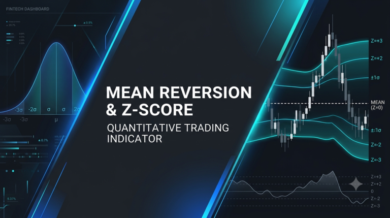
There’s a particular kind of paralysis that hits every retail investor at some point. You’re staring at charts — maybe it’s a Friday afternoon, maybe a red October morning — and you genuinely don’t know if the dip you’re looking at is a buying opportunity or the first step of something much worse. You read one analyst saying “the Fed is done, risk is back on.” You read another who says credit markets are flashing red. Both sound credible. Both probably have a Bloomberg terminal and a team of researchers. You have a brokerage account and a cup of coffee.
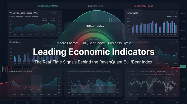
That gap — between the information that professional traders operate on and what the rest of us can actually see and use — is exactly what the RavenQuant Bull/Bear Index is designed to close. This isn’t a tipsheet. It isn’t a signal service that emails you buy/sell alerts. It’s a dashboard that synthesizes 17 different market factors into one coherent read on where the market regime stands right now — and crucially, where it has stood at any point over the past several decades. I want to walk you through how it actually works, feature by feature, the way I’d explain it to a friend who trades but isn’t a quant.
Read more about how the index is constructed here: Reading the Market’s Mood: How the RavenQuant Bull Bear Index Works
The Two Dials: Your 30-Second Gut Check

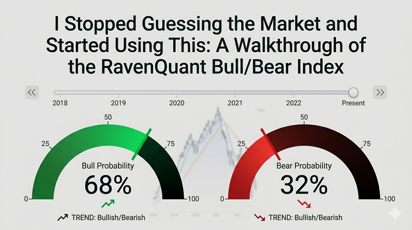
The first thing you see when you open RavenQuant is a pair of large semicircular dials — one green, one red. The green one is the Bull probability. The red one is the Bear probability. They always add up to 100%.
These aren’t just visual decoration. The dial needles show you, at a glance, where the composite model sits right now. If the Bull dial reads 30.3% and the Bear dial reads 69.7%, that’s the model saying: based on 17 different factors spanning equity volatility, credit markets, leading indicators, and macro positioning, conditions look substantially more bear-like than bull-like right now. That’s a pretty clear signal to sit up and pay attention.
What makes the dials more than just a pretty number is the contextual hint system underneath each one. As the probability value moves across different ranges, the hint text changes to give you a plain-English interpretation of what that level actually means — something like “Strongly bearish conditions, elevated caution warranted” near one end of the spectrum, or “Neutral, watch for confirmation either way” in the middle. You’re not left staring at a number trying to remember what it means. The dial tells you.
There’s also a small directional arrow on each dial — a red indicator showing whether that probability is moving up or down. That arrow is easy to overlook, but it matters. A Bear probability sitting at 65% and trending higher is a different situation than one sitting at 65% and rolling over. The direction tells you something about momentum, about whether conditions are getting worse or starting to stabilize. The combination of the current level and the trend direction gives you a much richer read than a single number ever could.
Time Travel: The Feature That Changes Everything
Here’s where RavenQuant gets genuinely fun — and genuinely useful.
Across the top of the page sits a full-width timeline slider, labeled simply “TIMELINE.” It shows a date range — say, 2021-04-01 to 2026-03-31 — with a draggable thumb. When you grab that thumb and drag it to any point in history, the entire page updates instantly. The dials change. The factor gauges change. The table changes. You are looking at exactly what the model would have shown you on that date, with the data that was available at that time.
That’s the time-travel feature, and it’s hard to overstate how useful it is once you start using it.
Want to know what the model was saying in October 2022, right at the S&P 500 lows? Drag the slider back there. Were the Bear probabilities extreme — suggesting maximum fear was already priced in — or were they still elevated, suggesting more pain ahead? You can answer that question in about two seconds. Want to check March 2020? The pre-Covid high in February 2020, before most people realized what was coming? Drag the slider. Look at the dials. See which factors were already deteriorating before the crash became front-page news.
If you don’t want to drag manually, there are navigation buttons along the header: jump back or forward by a week, a month, or a full year with one click. There’s also a “Go to [date]” input where you can type a specific date — say, the day after an FOMC decision or the morning of a major jobs report — and jump there instantly. The header also offers time range presets — 5Y, 10Y, 20Y, 30Y, 40Y, 50Y, Max — that snap the chart’s visible window to that period. Combined with the timeline slider, these let you zoom out to the full historical record or zoom in to a specific cycle within seconds.
This kind of historical context is, frankly, what separates informed decisions from guesses. Most retail investors look at today’s chart in isolation. The timeline slider forces you to think in regimes — to compare now to then.
The Factor Gauges: What’s Actually Driving the Number
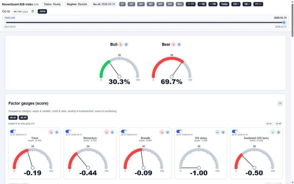
Below the dials, the dashboard opens up into something more detailed: 17 factor gauges, organized into four categories. The categories are equity & volatility, credit & rates, leading & fundamentals, and macro & positioning. Each gauge looks like a miniature version of the main dials — a semicircular arc with a needle, color-coded red (bearish) or green (bullish), showing the factor’s normalized score on a scale from -1 to +1.
Each gauge card also shows the factor name, the date the data was last updated, a directional arrow indicating whether that factor’s score is improving or deteriorating, and an info icon you can tap to get context on what the factor actually measures.
But here’s the feature that makes the gauges interactive rather than just informational: every factor has a toggle switch. You can turn individual factors on or off. There are also “all on” and “all off” buttons for each category, and master toggles for all 17 factors at once.
When you toggle a factor off, it’s removed from the composite calculation — and the main dials update in real time to show you what the Bull/Bear probability would look like without that factor. This is incredibly powerful for stress-testing your own view. Maybe you think the VIX is being artificially suppressed and you don’t trust it as a signal right now. Turn it off. See what the model says without it. Maybe you want to isolate just the credit and macro factors to see what that subset is telling you. Turn everything else off, leave those on, and read the dials.
The directional arrows on each gauge are worth paying attention to individually, not just in aggregate. If the overall composite is neutral but three of the four credit factors are trending negative, that’s a warning sign that might not be obvious from the top-level dial alone. The gauges let you look under the hood.
The Factor Breakdown Table: For When You Want the Full Picture
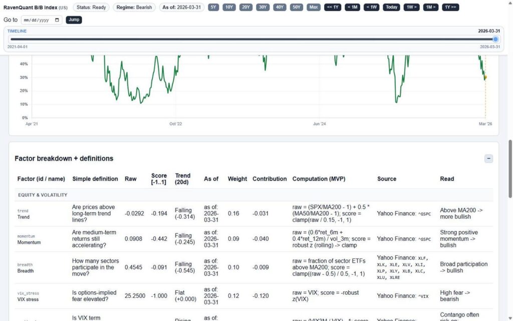
If the dials are the 30-second read and the gauges are the five-minute deep dive, the factor breakdown table is what you open when you want to really understand why the model is where it is.
The table lists all 17 factors with a lot more detail than the gauges. The key columns to understand:
Raw — the actual underlying data value. VIX at 25.25. Unemployment at X percent. Yield curve at -0.40. This is the ground truth, the thing the model is actually reading.
Score [-1..1] — how that raw number gets translated into a standardized signal. All 17 factors speak the same language at this level — positive is bullish, negative is bearish, and the magnitude tells you how strong the signal is.
Trend (20d) — the 20-day direction and delta. A factor can be in bearish territory but improving — “Rising (+0.231)” — and that’s very different from one that’s bearish and accelerating lower, “Falling (-0.314).” The trend column captures momentum.
Contribution — each factor’s actual weighted contribution to the overall composite score. This is where you find out that one factor is doing most of the work — or that the bearish read is broadly distributed across many factors, which tends to be a more reliable signal.
Read — a plain-English interpretive label for the current score. Not a number — a phrase. Something like “moderately bearish” or “neutral / watch for confirmation.” If you’re someone who thinks in words rather than decimals, this column is your friend.
There’s also a Computation (MVP) column that shows the actual formula being used for each factor, and a Source column with the data sources and ticker symbols (Yahoo Finance, FRED, and others). That level of transparency is unusual — it means you’re not just trusting a black box. You can see exactly what data is going in and how it’s being processed.
The Chart: Where History and the Present Collide
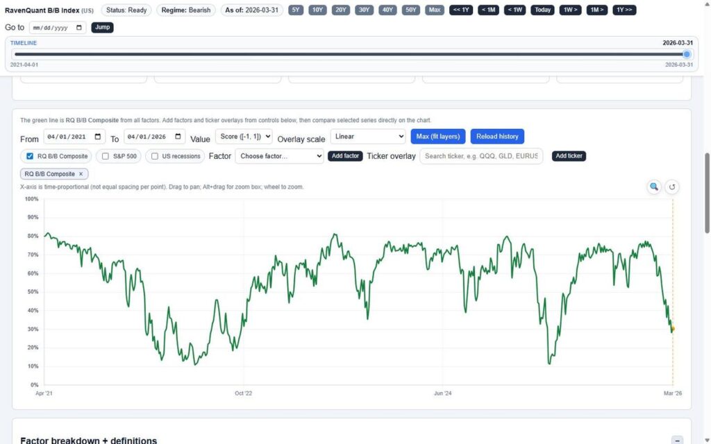
The main chart plots the RavenQuant B/B Composite score as a green line over time. A dashed vertical line marks the currently selected date — the same position as the timeline slider — so as you drag through history, the cursor moves in sync with the dials and table. Everything stays coherent.
The chart is interactive in the way you’d expect from a modern tool: drag to pan, use the scroll wheel to zoom, or Alt+drag to draw a zoom box around a specific period. The X-axis is real calendar time — so periods of rapid change look compressed and long flat stretches look, well, long. That’s correct. It respects how time actually feels in markets.
But the real power of the chart is in the overlays.
You can add the S&P 500 as a line on the same chart. You can add US recession bands as shaded vertical regions — suddenly you can see exactly how the composite score behaved in the months leading into and coming out of every recession in the dataset. You can overlay any of the 17 individual factors to see how they’ve moved historically relative to the composite. And then there’s the ticker overlay input: type any valid Yahoo Finance ticker — QQQ, GLD, TLT, BTC-USD, EURUSD=X, ARKK, whatever you care about — and it gets plotted alongside the composite.
Think about what you can do with that. Plot GLD against the composite and see whether safe-haven flows have historically preceded or followed shifts in the bull/bear regime. Plot TLT and see how long-duration bonds have related to the composite signal across different rate cycles. Chart the S&P 500 against the composite during 2022 and see whether the model was already deteriorating before the index rolled over — or whether it lagged. That kind of visual historical analysis used to require a data terminal and a quant who knew how to use it.
You can flip the Y-axis between Score [-1, 1] and probability % depending on which representation makes more sense to you. There’s also a “Max (fit layers)” button that auto-scales all the overlaid series so they’re visually comparable on the same axis, which keeps things readable when you’ve added several lines at once.
This Used to Require a Bloomberg Terminal
The RavenQuant Bull/Bear Index does something quietly remarkable: it takes the kind of multi-factor regime analysis that institutional desks have been running for decades and puts it on one page with a single slider.
You don’t need to know what a z-score is. You don’t need to understand how factor weights are calculated. You don’t need to run Python or pull data from FRED yourself. You just need to know how to read a dial, drag a slider, and look at a chart.
What you get in return is something genuinely valuable: context. Not a prediction of what the market will do tomorrow, but an honest, systematic read of what conditions look like right now and what they’ve looked like at comparable moments in history. That context is what separates reactive trading — panicking at bottoms, chasing at tops — from thoughtful positioning based on where we actually are in the cycle.
Whether you use it as a sanity check before a major position decision, a backdrop for evaluating sector ETFs, or just a weekly five-minute habit to keep your market read calibrated, the tool is built to be useful without requiring you to become an analyst. That’s the whole point, and in my experience, it delivers on it.
Data sources referenced by the RavenQuant B/B Index include Yahoo Finance and the Federal Reserve Economic Data (FRED) database. Factor scores, weights, and contributions are updated as new data becomes available.