Why Moving Averages Still Matter in 2026
This article is part of the series describing the factors included in the RavenQuant Bear/Bull Index. For as long as markets have existed, traders have tried to answer one fundamental question: is this a market I should be buying into, or one I should be defending against? There are a thousand ways to approach that question — earnings growth, Fed policy, macro data, sentiment surveys — but one of the most durable answers in technical analysis has turned out to be almost embarrassingly simple: compare the current price to where price has been over the recent past. That’s what S&P 500’s moving averages do. And after decades of use by everyone from individual swing traders to pension funds and systematic quant strategies, the 50-day and 200-day moving averages have earned their place as the baseline for market regime analysis.
MA50 vs MA200: What They Actually Measure
A moving average smooths out the noise. On any given day, the market can gap up or down on a tweet, a CPI print, or a rumor about Fed policy. The 50-day moving average (MA50) takes the closing prices over the last 50 trading days and averages them — roughly two and a half calendar months of market history. The 200-day moving average (MA200) does the same over 200 sessions, which works out to just under a year of trading.
The MA50 captures medium-term momentum. The MA200 is where long-term regime classification really lives. When price is above the MA200, the primary trend is broadly considered intact. When it’s below, you’re operating in a different environment entirely — one where the longer arc of price history is no longer supporting new buyers.
The distinction between “noise” and “regime” is genuinely important. Being 2% below a short-term moving average in an otherwise healthy bull market is nothing. Being 15% below a declining 200-day moving average that itself is trending lower is an entirely different conversation. The MA200 doesn’t lie about the big picture.
These names get thrown around a lot in financial media, sometimes to the point of becoming market chatter noise themselves. But the underlying logic is sound enough to warrant attention.
Golden Crosses, Death Crosses, and Why They’re Overhyped and Underrated
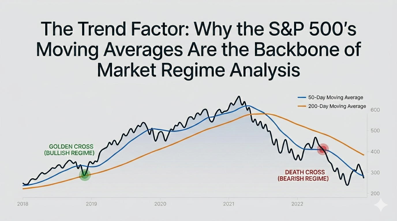
A golden cross occurs when the 50-day moving average crosses above the 200-day moving average. It typically signals that the medium-term trend has aligned with the long-term trend, both pointing upward. Markets tend to perform well in the aftermath — historical data going back to 1928 shows a median positive return of around 11% from golden cross to the next death cross.
The death cross is the reverse: the MA50 drops below the MA200. It tends to precede or accompany material drawdowns. The death cross that formed in March 2022 — as the Fed began its most aggressive hiking cycle in four decades — kicked off a bear market that didn’t fully resolve until well into 2023. The 2008 death cross, which formed earlier that year as credit stress was building, gave investors a readable signal that the tape had shifted well before the acute phase of the crisis hit.
That said, analysis from Nasdaq is worth keeping in mind: the average drawdown from a death cross since 1950 is about 10%, but it’s highly variable. Some death crosses lead to shallow, quickly-recovered dips. Others — 2000 and 2008 especially — were the opening chapter of multi-year destruction.
The 200-Day Line as a Regime Filter, Not a Magic Number
There’s a reason pension funds, macro hedge funds, and rules-based quant strategies all tend to treat the 200-day moving average as a first-order filter. The track record is remarkably consistent.
Since 1950, the S&P 500 has spent roughly 71% of all trading sessions above its 200-day moving average, and returns during those sessions are substantially better than during periods spent below it. The major exceptions — the extended breaks below the MA200 seen in 2000–2002 and 2007–2009 — weren’t just bad months. They were full regime shifts where buying “dips” below the 200-day turned into catching falling knives for years.
During the 2008 financial crisis, the S&P 500 crossed below its 200-day moving average in late 2007 and didn’t reclaim it convincingly until 2009. Anyone using the MA200 as a regime signal had a usable early warning that this was not a normal correction. The same pattern held in 2022 when the index spent most of the year below its 200-day, a period that aligned with peak inflation, aggressive Fed rate hikes, and broad equity multiple compression.
The flip side: when the MA200 is rising and price holds above it, the regime tends to stay forgiving even when shorter-term pullbacks look alarming. The October 2023 dip briefly touched the 200-day moving average and then recovered sharply — the market went on to rally over 27% in the subsequent twelve months.
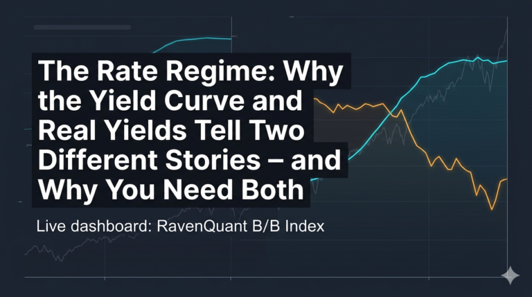
Using Two SP& 500’s Moving Averages Instead of One
The MA50 and MA200 work best as a pair rather than in isolation. The MA200 tells you about the long-term regime — whether you’re operating in a genuine bull or bear market environment — while the MA50 adds a secondary read on near-term momentum.
The intuition goes something like this: if the S&P 500 is well above its 200-day average and the 50-day is also above it, the trend is confirming itself across multiple timeframes. If price has started to slip below the MA50 but remains above the MA200, the intermediate trend has weakened but the primary regime is still intact. These gradations matter for risk management decisions — sizing positions, deciding how much defensive exposure to carry, how aggressively to buy pullbacks. A two-moving-average framework captures that nuance in a way neither number alone can provide.
Trend Signals Are Lagging by Design — That’s the Point
Trend-following by nature is a lagging strategy. Moving averages don’t predict the future; they describe the recent past in a smoothed form. If you’re hoping the trend factor will tell you when the market is about to top out, you’re going to be consistently disappointed. By the time the MA50 crosses below the MA200, the damage is usually already well underway.
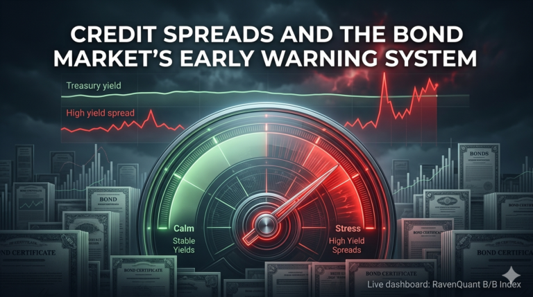
That’s why serious regime analysis pairs the trend signal with leading indicators — breadth deterioration, credit spread widening, volatility spikes — that can flash warning signs before price confirms. The trend factor is the anchor for regime classification, not the early warning system. It confirms what other factors are suggesting, and provides persistence to the regime signal rather than reacting to every week of market noise.
For day traders or short-term swing traders, moving average-based regime signals probably feel unbearably slow. For anyone managing risk over months rather than minutes, that’s actually a feature.
From Charts to Scores: How RavenQuant Builds the Trend Factor
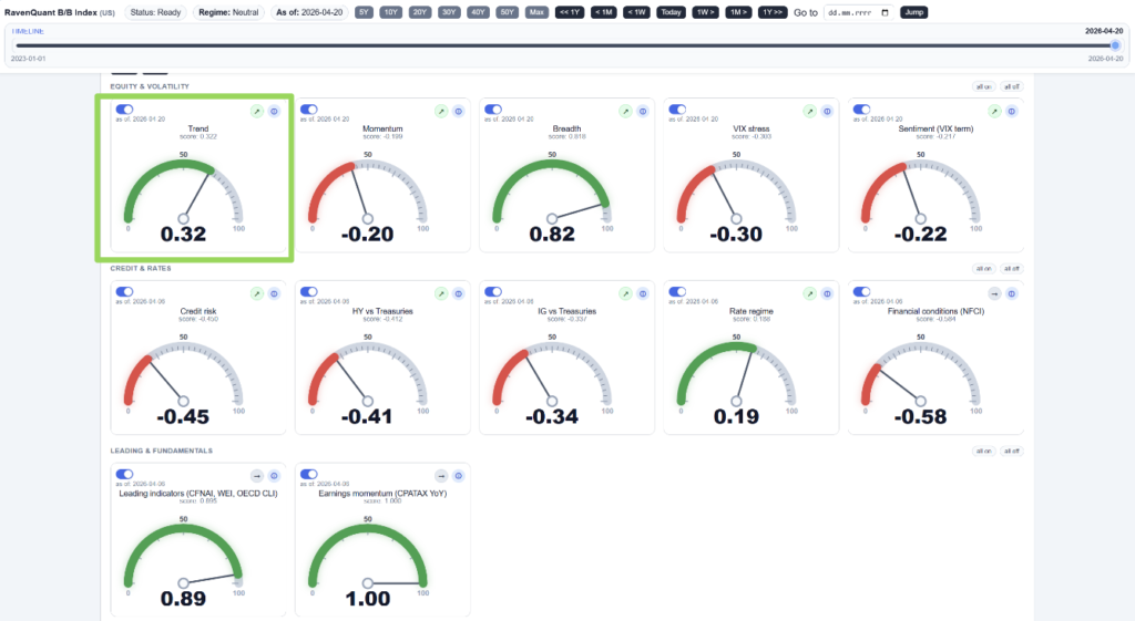
The RavenQuant Bear/Bull Index does not use a binary rule such as “above or below the 200-day line.” The trend factor is a continuous score built from the same MA50 and MA200 logic described above, then mapped into a normalized range so it can be combined with the other sixteen factors.
Raw signal. Let SPX be the S&P 500 level, MA50 and MA200 its 50- and 200-day simple moving averages. The model uses:
trend_raw = (SPX / MA200 – 1) + 0.5 * (MA50 / MA200 – 1)
The first term is how far price sits above or below the long-term average. The second term (half-weight) is the golden-cross / death-cross geometry: when MA50 is above MA200, it adds bullish pressure; when below, it adds bearish pressure. That matches the two-timeframe story in this article, but as one number instead of separate rules.
Normalization. The raw value is divided by 0.15 and clipped to [-1, +1]. That is the trend_score stored for the factor. A score of +1 means the market is stretched strongly on the bullish side of this measure; -1 means strongly bearish; 0 is neutral relative to the MAs.
Approximate tiers (interpretation, not separate rules in code):
+1.0: Strong bull — price well above MA200 with MA50 above MA200 (raw about +0.15 or more, capped).
+0.5 to +0.7: Healthy uptrend — price meaningfully above MA200; golden cross typically intact.
+0.2 to +0.4: Mild bull / consolidation above the long-term average — MA50 may be close to MA200.
0.0: Neutral — price and short average near the 200-day (crossover zone).
-0.2 to -0.4: Soft bearish — price slipping below MA200 or MA50 rolling over.
-0.5 to -0.7: Clear stress — death cross or sustained trade below MA200.
-1.0: Strong bear — deep dislocation below MA200 with bearish MA alignment (raw about -0.15 or worse, capped).
Composite weight. The trend factor has a weight of 16% in the default RavenQuant composite — the single largest factor share — because MA regime is treated as the backbone anchor, consistent with the role described earlier in this article.
The composite then blends all factor scores (including trend) into sentiment_score, maps that to p_bull and p_bear, and assigns Bullish / Neutral / Bearish labels at the index level using thresholds on p_bull (not on the trend score alone).
Reading the Trend Factor Inside the RavenQuant Bear/Bull Index
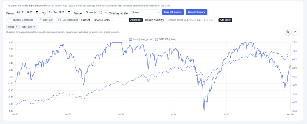
If you want to see how the trend factor is currently reading and how it’s been trending, it’s one of the inputs tracked in the RavenQuant B/B Index — you can check its current score and 20-day trend direction alongside all the other regime factors in the composite.