Live dashboard: RavenQuant B/B Index
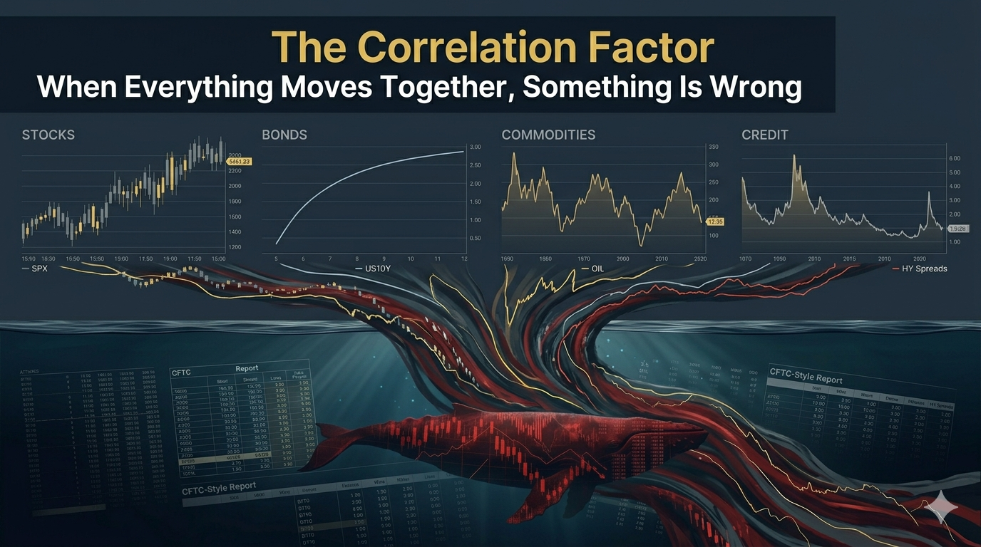
Correlation Factor is a key market regime signal for investors. There is a concept that experienced portfolio managers know well and newer investors tend to discover the hard way: diversification is not a permanent feature of markets. It is a condition that exists in normal times and disappears at the worst possible moment. When a genuine macro shock hits – not a garden-variety correction, but an actual systemic event – the correlations between asset classes that normally provide protection collapse toward one. Stocks fall. Bonds fall. Commodities whipsaw. Credit spreads explode. Everything moves together, and the diversification you thought you had turns out to be an illusion.
Understanding how to detect this cross-asset coherence – before the full damage is done – is one of the more sophisticated skills in macro analysis.
Why Correlation Spikes Signal Fragile Market Breadth
In normal market conditions, different asset classes have characteristic relationships. Equities and commodities tend to have a moderate positive correlation – both tend to do well when growth is strong and the global economy is expanding. Equities and credit stress tend to move inversely – when credit spreads widen (bond prices fall), equities usually decline as well, but the relationship is not one-for-one.
These baseline relationships exist for structural economic reasons, and they are relatively stable across most market environments. Correlation stress describes what happens when these characteristic relationships suddenly shift – when the magnitude of correlations spikes dramatically, when assets that normally move independently start moving in near-perfect lockstep, or when the usual sign of a correlation reverses.
A useful way to monitor this is through rolling correlations between the S&P 500 (^GSPC), high-yield and investment-grade bond ETFs (HYG and LQD), and a broad commodity ETF (DBC). When the 60-day rolling correlations across these instruments start spiking or behaving unusually, it suggests the market is being driven by a common macro shock rather than the usual variety of independent drivers.
How to Read Diversification Breakdown in Real Time
Correlations are bounded between -1 and +1. This creates a statistical problem: the sampling distribution of raw correlation coefficients is skewed and depends on the underlying population correlation. A change from r=0.2 to r=0.4 is not statistically equivalent to a change from r=0.8 to r=1.0, even though they both represent a 0.2 shift in raw correlation.
The Fisher z-transformation solves this by converting correlations into a continuous scale that spans the entire real line and has a sampling distribution that is approximately normal. The transformation is: z = 0.5 * ln((1+r)/(1-r)). This converted value can then be standardized using robust methods – median and MAD rather than mean and standard deviation – without the distortions that come from working with raw bounded correlations.
It is a methodological detail, but it matters: using the Fisher transform means that a shift from low correlation to very high correlation is treated with the weight it deserves in a composite score, rather than being flattened by the bounded nature of raw correlation coefficients.
Case Studies: Correlation Stress in 2020 and 2022
The most vivid recent example of correlation stress is March 2020. In normal times, U.S. Treasuries act as a safe haven – when equities sell off, investors flee to bonds, and Treasury prices rise (yields fall). This is the classic equity-bond negative correlation that underpins traditional 60/40 portfolio construction.
In March 2020, the COVID-19 panic was so severe that even Treasuries were sold aggressively as investors liquidated everything for cash. The traditional equity-bond diversification benefit temporarily broke down. Equities, bonds, and commodities were all falling simultaneously, driven by a single overwhelming factor: the need for liquidity. The Federal Reserve Bank of New York described it as a global dash for cash that caused deterioration in market functioning across multiple asset classes at once.
This is the signature of correlation stress: assets that should protect each other are instead falling together.
The 2022 episode showed a different kind of correlation anomaly. When Russia invaded Ukraine in February 2022, energy prices surged sharply. Oil briefly touched per barrel – levels not seen since 2008. Normally, rising commodity prices accompanied by strong global growth would be a mixed but manageable environment for equities.
Instead, 2022 saw oil and other commodities spike while equities fell sharply. The correlation between equity returns and commodity returns was unusually high – but in a way that confounded the usual diversification logic. Rising oil was not a sign of growth; it was an inflationary shock that was tightening financial conditions and raising recession probabilities. Research published in PLOS ONE documented how the Russia-Ukraine conflict strengthened commodity-equity market linkages with crude oil emerging as a core transmission channel for cross-asset risk.
This kind of unusual cross-asset pattern – correlations behaving differently from their historical norms in ways that suggest a macro regime shift – is exactly what rolling correlation analysis is designed to surface.
Limitations and Practical Use
Cross-asset correlation is an inherently noisy measure. Sixty-day rolling correlations can shift meaningfully due to short-term market quirks that do not represent a real regime change. The Fisher transformation helps, but no normalization procedure fully eliminates the noise in correlation data. There is also a timing problem: by the time cross-asset correlations are spiking dramatically, other indicators – credit spreads, yield levels, volatility measures, positioning data – have almost certainly already signaled the stress. Correlation stress is rarely the leading signal in a macro deterioration; it tends to confirm what other measures are already showing. This makes it genuinely supplementary information rather than a primary regime indicator. It adds a layer of cross-asset pattern recognition that can be useful precisely because it measures something structurally different from any individual asset class signal.
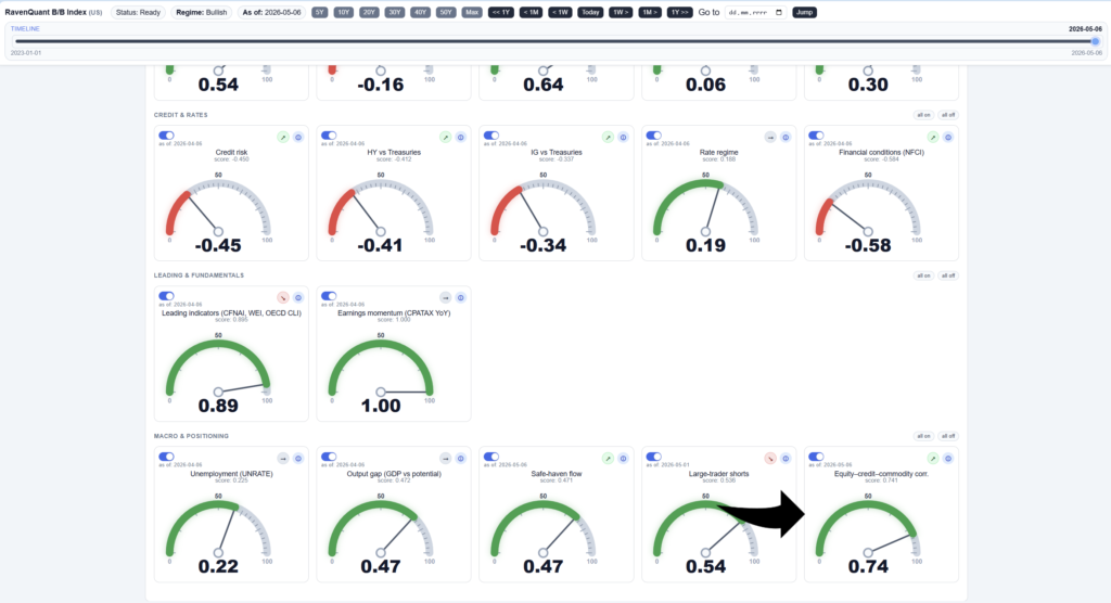
How RavenQuant Integrates Correlation Stress in Real Life
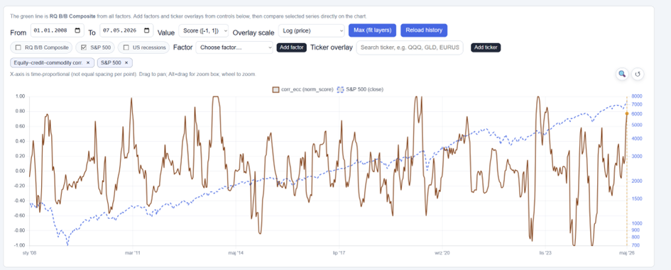
The Equity-Credit-Commodity Correlation factor – using 60-day rolling correlations between the S&P 500, HYG, LQD, and DBC, Fisher-transformed before normalization – is one of the inputs in the RavenQuant B/B Index at ravenquant.com. If you want to see how cross-asset coherence is reading right now alongside the full set of macro signals, it is tracked there.
Explore the live index here: https://bull-bear-analyzer-production.up.railway.app