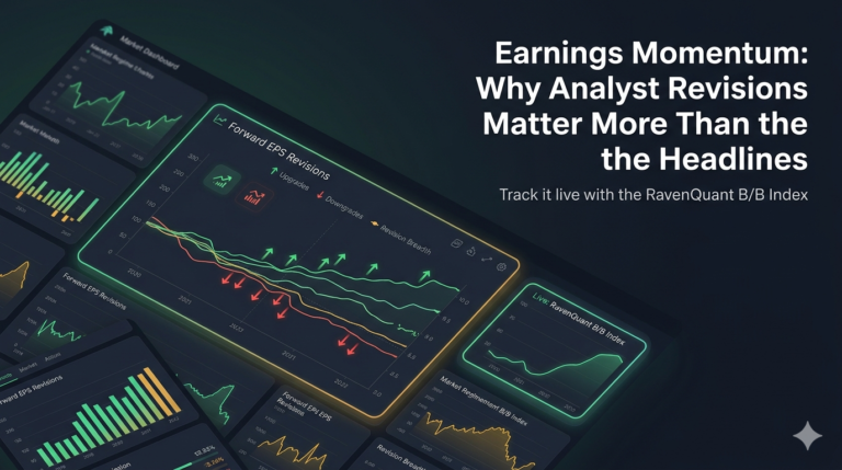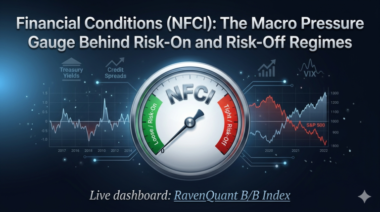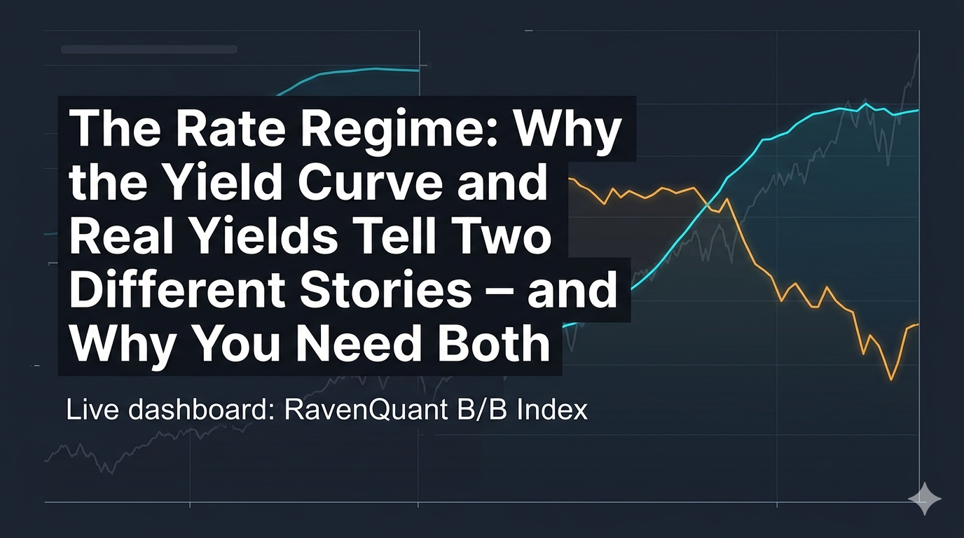
Live dashboard: RavenQuant B/B Index
The yield curve gets talked about endlessly in financial media, and for good reason. It has an astonishing track record as a recession indicator. But using it in isolation misses half the story of what interest rate conditions are actually doing to the economy. The rate regime is not just about the shape of the curve — it’s about whether the absolute level of rates is tightening or loosening the financial system’s grip on growth. That’s where real yields come in, and why serious macro analysis combines both rather than treating them as alternatives.
What the 10Y-2Y Yield Curve Says About Recession Risk
The 10-year minus 2-year Treasury yield spread is probably the most-watched number in macroeconomics after the unemployment rate and CPI. FRED tracks it as the T10Y2Y series, updated daily. When long rates exceed short rates, the curve is “steep” — banks can borrow cheaply short-term and lend profitably long-term, credit flows, and the economy tends to expand. When short rates exceed long rates, the curve is “inverted” — a condition that has preceded every US recession since the early 1970s.
The predictive mechanism isn’t just mathematical. An inverted curve reflects the market’s collective bet that short-term rates will fall in the future — which only makes sense if you expect economic weakness or Fed rate cuts. It’s a forward-looking signal embedded in real money being deployed by bond traders with actual skin in the game. The NY Fed’s recession probability model is built directly on this spread because of its historical reliability.
According to YCharts analysis of the historical record, the 2-10 spread has inverted before seven of the last eight US recessions since 1968 — an 87.5% accuracy rate. More importantly, inversions lasting longer than three months show a 73% recession probability, compared to only 45% for shorter ones. Duration matters.
Why Yield-Curve Inversions Can Stay Early for a Long Time
The yield curve does not crash markets immediately. This is where people get confused and frustrated when they use the curve as a short-term trading signal and nothing seems to happen. Historically, the lag between initial inversion and recession onset has ranged from 7 to 24 months, with roughly 12 months as a typical average. The economy can keep growing for over a year after the curve inverts — businesses still have pipeline demand, consumers are still spending, the momentum of the previous expansion carries forward.
The 2022–2024 cycle illustrated this vividly. The yield curve inverted in the spring of 2022 and stayed inverted for what became the longest inversion in modern history — over two years — without producing a recession in the traditional sense. Anyone treating inversion as an immediate sell signal would have been sitting in cash through a significant portion of the subsequent recovery.
How Real Yields Complete the Rate-Regime Picture
The 10-year real yield — the nominal yield minus inflation — answers a question the nominal yield curve can’t: how tight is monetary policy actually? A 5% ten-year Treasury yield is very different economic medicine depending on whether inflation is running at 2% (a real yield of +3%, genuinely restrictive) or 6% (a real yield of -1%, still accommodative despite the high nominal rate).
FRED’s DFII10 series — the 10-year TIPS yield — is the cleanest available proxy for real yields because it’s directly market-priced rather than constructed from nominal yields and survey-based inflation expectations. When DFII10 is deeply negative, as it was through most of 2020 and 2021, money is effectively free in real terms — a profoundly stimulative condition. When it rises sharply into positive territory, the real cost of capital is increasing and valuations on long-duration assets (growth stocks, real estate, venture capital) come under pressure.
The 2022-2024 Real-Yield Shock in Context
The 2022 rate environment was genuinely extreme by modern standards. Real yields went from roughly -1% to over +1.5% in less than twelve months as the Federal Reserve hiked at the fastest pace in decades to combat post-pandemic inflation. Simultaneously, the yield curve was inverting. Both components of the rate regime picture were signaling bearish conditions at the same time. Equities fell roughly 20% on the S&P 500 and growth stocks and speculative assets fell far more. The rate backdrop deteriorated by both measures simultaneously — not because of any prediction, but because the data was straightforwardly bad.
Combining Curve Shape and Real Yields
The logic of reading these two together is intuitive: a steep curve plus negative real yields is the most unambiguously bullish rate backdrop — banks have strong lending incentives and money is cheap in real terms. An inverted curve plus high positive real yields is the most bearish — credit conditions are tightening and the real cost of borrowing is elevated. Each on its own can mislead; together they give a more complete picture of whether the rate environment is working with or against equity market bulls.
Rate conditions matter enormously over long cycles, but shorter-term price dynamics, breadth, and sentiment can diverge from rates for extended periods. The yield curve and real yields are structural backdrop signals, not high-frequency ones — which is precisely what makes them useful as anchors in a multi-factor regime framework rather than standalone timing tools.
Track the Live Rate-Regime Reading in RavenQuant
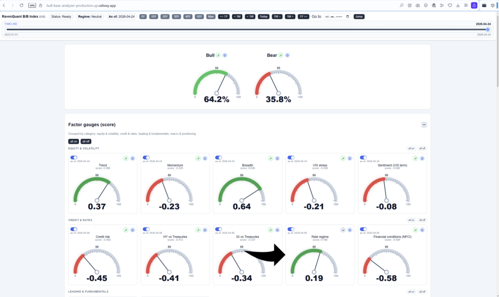
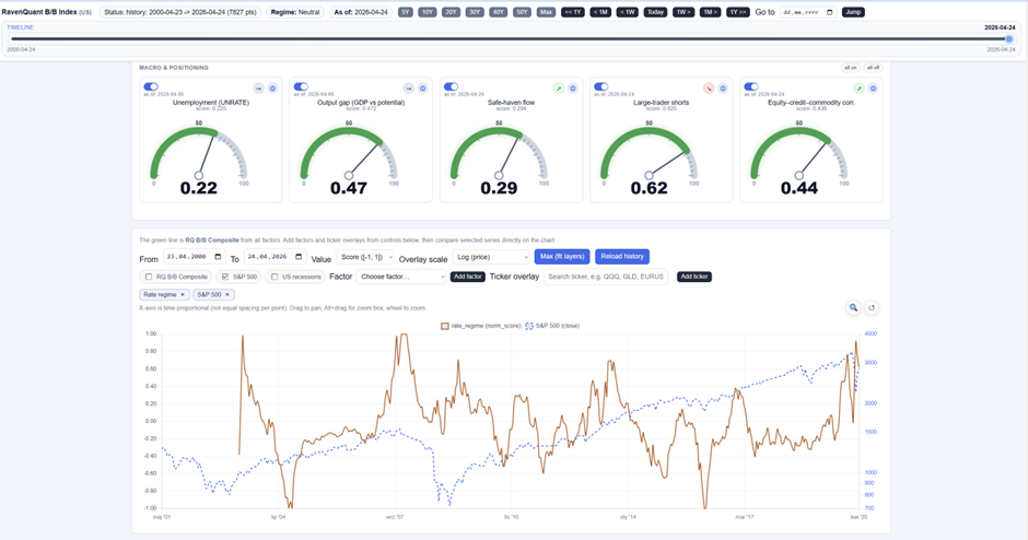
The current Rate Regime reading — reflecting the latest T10Y2Y spread from FRED and the DFII10 real yield from FRED — is one of the factors tracked in the RavenQuant B/B Index at ravenquant.com, normalized against its own history with a 20-day trend arrow showing whether the rate backdrop is improving or deteriorating.
Explore the live index here: https://bull-bear-analyzer-production.up.railway.app