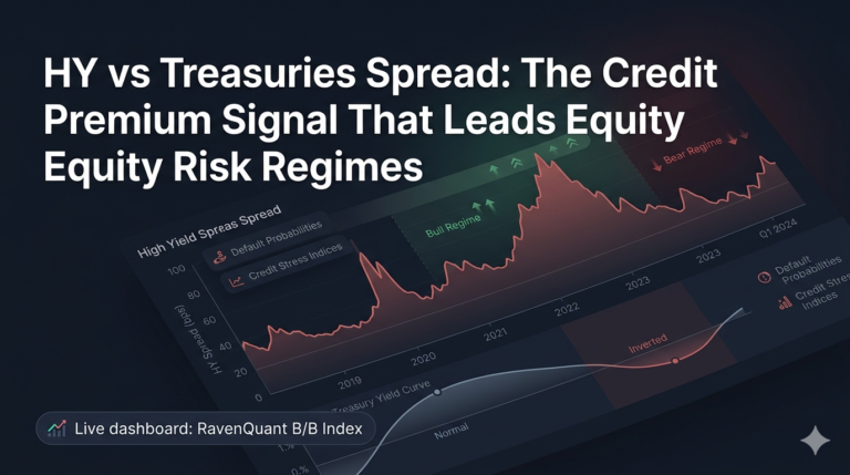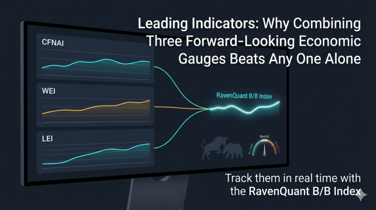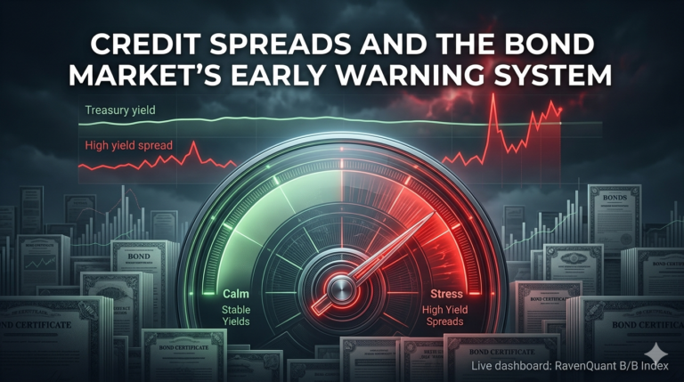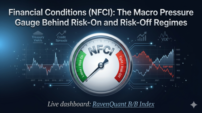
Live dashboard: RavenQuant B/B Index
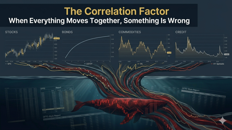
There’s a version of a bull market that looks great on the surface but is quietly falling apart underneath. The index hits a new high, the headlines are bullish, and then you start digging into the internals — and you find that most of the market is actually going nowhere or sliding. A handful of mega-cap stocks are doing the heavy lifting, and everything else is drifting. This is what weak breadth looks like, and it matters more than most casual market watchers realize.
Why Breadth Matters
Market breadth, in its simplest form, asks: how many participants are actually joining this rally? A move in a cap-weighted index like the S&P 500 can be driven almost entirely by a few enormous companies. If Apple, Microsoft, Nvidia, Alphabet, and Amazon are all ripping higher while energy, industrials, materials, and utilities are lagging, the index can still make new highs — but the underlying economic and market signal is very different from a broad, synchronized advance.
The analogy that gets used constantly in technical analysis is the generals vs. soldiers metaphor. The generals (the large-cap leaders) might be winning battles, but if the soldiers (the broader market) aren’t following, you don’t have a healthy advance. You have a fragile one. When leadership concentrates, a stumble in one or two names can trigger outsized index damage because there’s nothing else to absorb the blow.
Using the 200-day moving average as the measuring stick makes the analysis long-term in nature. A sector or stock trading above its MA200 means the broad trend in that segment of the economy is intact. When most sectors are above it, you have broad secular momentum. When only two or three are, you have a market that’s surviving on concentrated life support.
How We Measure Breadth
One clean way to measure breadth is to track what fraction of the 11 SPDR Select Sector ETFs are trading above their 200-day moving averages. The SPDR Select Sector ETFs from State Street slice the S&P 500 into 11 distinct segments of the economy: Technology (XLK), Financials (XLF), Health Care (XLV), Consumer Discretionary (XLY), Consumer Staples (XLP), Energy (XLE), Industrials (XLI), Utilities (XLU), Materials (XLB), Real Estate (XLRE), and Communication Services (XLC). Together, they account for the entirety of the S&P 500’s constituents.
These ETFs have been trading long enough to have meaningful track records through multiple market cycles. They’re liquid, widely followed, and their price behavior reflects real sector dynamics — capital flows, earnings trends, rate sensitivity, and macro positioning all show up in how these ETFs move relative to their 200-day averages.
How to Interpret Breadth Readings
The raw fraction of sectors above their MA200 tells you a lot before any further analysis.
When 8, 9, or all 11 sectors are trading above their 200-day moving averages, you’re looking at a genuinely broad market advance. Every corner of the economy is participating. Risk appetite is widespread, not narrow. Conditions like this are associated with healthy bull market phases where corrections tend to be shallow and brief. In January 2026, all 11 SPDR sector ETFs were trading above their 200-day moving averages simultaneously for the first time since November 2021 — a signal of genuine market breadth.
When 3, 4, or 5 sectors are above their MA200, you’re in risk-off territory regardless of what the index level says. The sectors that are holding their averages are likely the defensive ones — staples, utilities, maybe health care — which confirms a flight-to-quality posture in the market. The cyclicals — tech, industrials, consumer discretionary, financials — are probably the ones underwater, which tells you something meaningful about where the real economic expectations lie.
Real-World Example: The Magnificent Seven
The clearest recent example of what narrow breadth looks like in practice was the Magnificent Seven narrative that dominated 2023 and most of 2024. A handful of mega-cap tech and tech-adjacent names — Nvidia, Apple, Microsoft, Alphabet, Amazon, Meta, Tesla — drove the majority of the S&P 500’s return while most other sectors lagged significantly.
By mid-2023, as little as 1% of S&P 500 stocks were outperforming the median Magnificent Seven return on a rolling six-month basis — roughly five companies out of 500. The index looked fine on a headline basis. The breadth reading would have told a very different story. For anyone whose portfolio wasn’t heavily concentrated in those seven names, 2023 felt nothing like the index gains suggested.
Breadth is where you catch that divergence. The S&P 500 printing new highs while fewer than half the sectors hold above their 200-day moving averages is a yellow flag, not a green one.
Divergence Risk and Historical Parallels
The phenomenon of price and breadth diverging — sometimes called negative divergence — doesn’t always immediately resolve in favor of breadth. Markets can stay narrow for extended periods. The Nifty Fifty period of the early 1970s, when a narrow group of growth stocks carried the index while the broader market was deteriorating, eventually ended very badly. The dot-com era saw similar dynamics with technology leadership masking broad weakness, right up until the 2000 peak.
The lesson isn’t that breadth divergence triggers immediate reversals — it doesn’t. The lesson is that narrow rallies carry more risk per unit of gain than broad ones. If something breaks among the leaders, there’s no cushion.
Track It Live in RavenQuant B/B Index
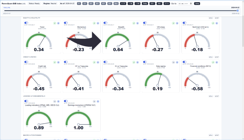
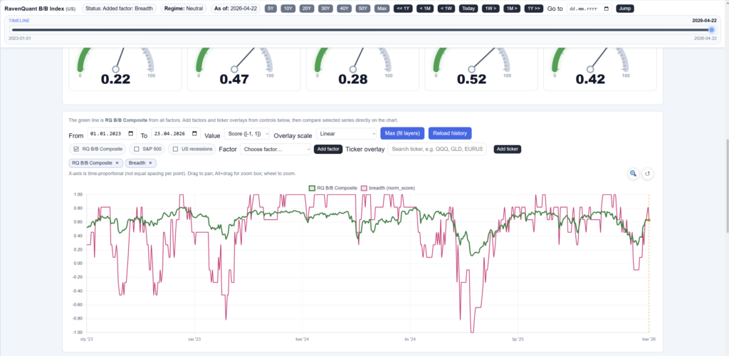
If you want to see how sector breadth is currently reading and whether it’s been improving or narrowing over recent weeks, it’s one of the inputs tracked in the RavenQuant B/B Index — you can check the current score and 20-day trend direction alongside all the other regime factors.
Explore the live index here: https://bull-bear-analyzer-production.up.railway.app