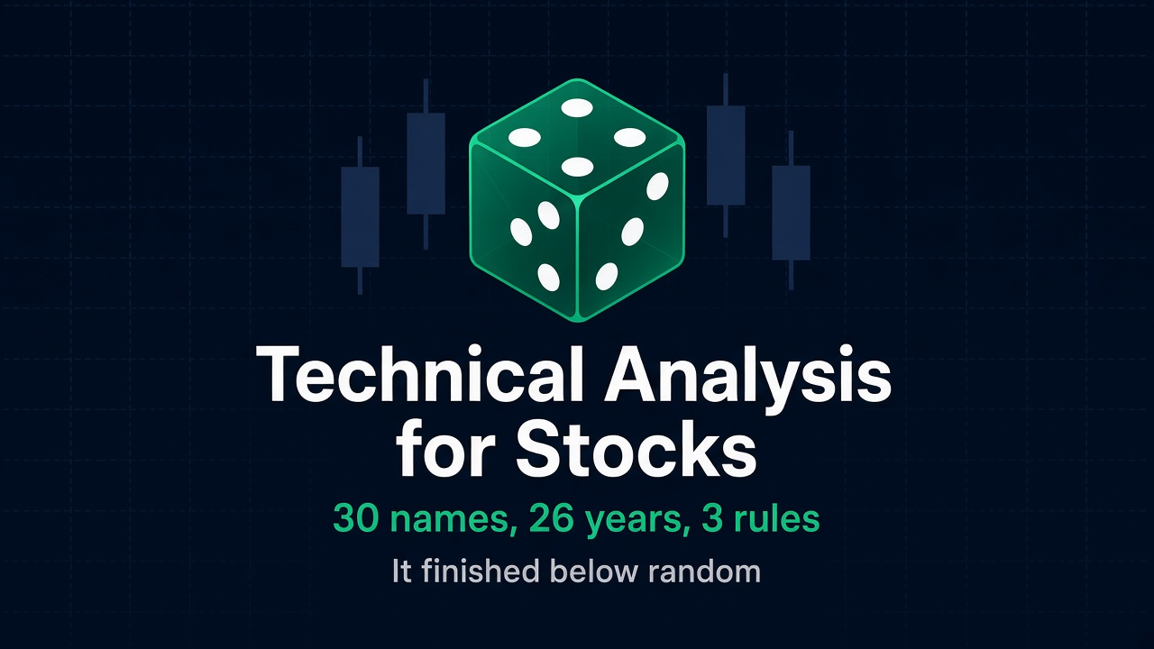
I ran the 50/200 moving average rule on 30 large American stocks, one at a time, for almost 26 years. The median name turned $10,000 into $31,030. Buying the same stock on day one and ignoring the chart turned it into $78,547. That gap is the short version of why technical analysis for stocks is a weaker tool than most people assume: on the median holding, the rule cost about 60% of the result.
Then I ran the control that changed my mind about what was going on. Instead of following the signal, I held each stock on randomly chosen days, matching the number of days the rule was invested, 500 draws per name. The rule landed at the 34th percentile of that random distribution for the median stock, and beat random on only 10 of the 30 names. It was not merely unprofitable. On most of these companies it picked worse days to be invested than chance did.
My first instinct was that this is a single-company problem: one stock is mostly its own noise, so average enough of them together and the signal should start working. I tested that too, and it is wrong. Equal-weight baskets built from the same 30 names, at every size from 3 to 30, left the rule between 3.2 and 4.1 points a year behind simply holding the basket, and still sitting around the 22nd to 36th percentile of random. Diversification did not rescue the chart.
I want to be clear about what I am and am not arguing, because “technical analysis does not work” is not my position. My position has two halves. A chart is a short-horizon instrument. Inside one session it describes something real and immediate, and that is where I think it earns its keep: daytrading, where you live inside a continuous auction with a hard stop and you go home flat. Over years, the information sits somewhere else entirely — in the business, and in where the market’s money is actually going. Both halves matter, so the rest of this piece tests the first half and then points at what replaced it in my own work.
Median stock, held
$78,547
$10,000 from January 2000
Median stock, 50/200 rule
$31,030
Same stock, same 26 years
Names where the rule won
3 of 30
All three were failing businesses
Rule vs random days
34th pct
Median name, equal time invested
The test I froze before looking at anything
Every number here comes from daily bars pulled from Yahoo Finance, 3 January 2000 to 18 September 2026. After the 200-day warmup the averages need, that leaves 6,518 trading days and 25.9 years per name. I wrote the rules and picked the names before looking at a single result, because the easiest way to prove anything about charts is to keep nudging a parameter until the equity curve smiles at you.
The universe is 30 large, liquid American companies that were already large in 2000: Apple, Microsoft, Johnson and Johnson, Coca-Cola, Exxon, GE, Intel, Cisco, IBM, Pfizer, Walmart, Procter and Gamble, JPMorgan, Bank of America, AT&T, Verizon, Disney, McDonald’s, Home Depot, Chevron, Merck, Amgen, Nike, Oracle, Qualcomm, Texas Instruments, Caterpillar, Boeing, 3M and Ford. Some of them multiplied many times over. Some went nowhere for a quarter of a century. I wanted both.
This article stays inside that universe. No index, no ETF, no futures, no currency pairs. An earlier draft of this piece compared the stocks against the S&P 500 and a few FX pairs, and I cut it: swapping the instrument changes the weighting, the participants and the structure of the market all at once, so a difference in the result tells you nothing about stocks. Everything below compares stocks with stocks.
50/200 average cross
Hold when the 50-day average of closes sits above the 200-day average, otherwise sit in cash. The most widely used trend rule there is. Around 40 round trips per name over 26 years, invested 64% of the time.
20-day breakout
Buy when the close exceeds the highest close of the last 20 sessions, sell when it drops under the lowest. Classic Donchian channel logic. Around 210 round trips per name.
RSI below 30
Buy when RSI(14) falls under 30, hold 10 sessions, then flat, with no overlapping entries. The standard oversold bounce, invested only 8% of the time.
Returns use the dividend and split adjusted series, so holding gets full credit for its dividends and the rules are not flattered by a total return being compared against a price return. Every rule pays 0.05% per side, which is generous for a modern broker and nowhere near enough to explain the results. Signals are computed on the close and acted on at the next close, so nothing trades on information it did not have. Gap and stop measurements use the raw open, high, low and close, because that is what a chart draws. Idle cash earns nothing, which I come back to in the caveats, and there is no tax, which flatters the rules rather than the holder.
Technical analysis for stocks lost to doing nothing on 27 of 30 names
Three rules, thirty companies, one table.
| Rule | Average growth per year | Median | Beat holding | Profitable at all | Average worst fall |
|---|---|---|---|---|---|
| Just hold the stock | 8.76% | 8.29% | n/a | 30 of 30 | −65.4% |
| 50/200 average cross | 4.67% | 4.47% | 3 of 30 | 26 of 30 | −52.2% |
| 20-day breakout | 3.48% | 2.64% | 2 of 30 | 24 of 30 | −54.1% |
| RSI below 30, 10-day hold | 1.04% | 1.35% | 1 of 30 | 22 of 30 | −40.1% |
| 20-day breakout, long and short | −6.62% | −6.00% | 0 of 30 | 3 of 30 | −88.8% |
After costs, across the same 30 names. Three things are worth sitting with.
First, the size of the miss. Four points of annual growth over 26 years is not a rounding error, it is most of the outcome. The median stock held to the end produced $78,547 from $10,000, and the same stock traded on the 50/200 rule produced $31,030.
Second, the long and short row. This is the honest test of whether a chart predicts direction, because it removes the crutch of being long a rising asset. Betting both ways on the breakout lost 6.62% a year, with an average worst fall of 88.8%, and was profitable on 3 of the 30 names. If a breakout on a single company carried directional information, trading it in both directions should not do that.
Third, the drawdown column is the one honest win. Every long-only rule sat in cash for part of every crash, so every long-only rule fell less than the stock did. The 50/200 version cut the average worst fall from 65.4% to 52.2%, and it was shallower on 25 of the 30 names. That is a real product. The question is its price.
The three names where the rule beat holding are the interesting part. GE, Cisco and Intel: one industrial conglomerate that spent two decades unwinding, and two technology companies that peaked in the dot-com bubble and then ground lower for years. The rule did not outsmart those charts. It sat in cash while three businesses deteriorated, which is a slow enough process that a reader of the annual reports would have got there first. Qualcomm is the other end of the range, giving up 9.9 points a year, because it spent the 2010s in long noisy swings that whipsawed a 200-day average without ever breaking the underlying growth.
The control that settles it: random days did better than the chart
Losing to buy and hold is not damning on its own. Any rule that sits in cash for 36% of a rising market will finish behind, and that says more about the market rising than about the signal. So I ran the control that removes the excuse.
For each stock I counted how many days the 50/200 rule was invested, then held that same stock for the same number of days chosen at random, 500 times, with a fixed seed. Both versions own the same company for the same length of time. The only difference is whether the days were picked by the chart or by a random number generator. If the signal knows anything, it should win.
It did not. For the median name the rule landed at the 34th percentile of its own random distribution. It fell in the bottom half on 20 of the 30 stocks and in the bottom quarter on 12. Averaged across the universe the rule made 4.67% a year while random days with equal time invested made 5.78%.
Diversifying the same 30 names did not rescue the signal
Here is where I expected to find the escape hatch, and did not.
The standard defence of trend following is that it needs a diversified thing to work on: one company is mostly idiosyncratic noise, average enough of them and the noise cancels, leaving something a trend rule can grip. It is a reasonable story. So I built equal-weight baskets from these same 30 stocks, at sizes 1, 3, 6, 10, 20 and 30, drawing 200 random baskets at each size below 30, and ran the identical rule and the identical random control on each basket.
| Stocks in the basket | Holding it | 50/200 rule | Rule minus holding | Median percentile vs random | Baskets where the rule beat random |
|---|---|---|---|---|---|
| 1 (single names) | 8.76% | 4.67% | −4.08 pts | 36th | 10 of 30 |
| 3 | 11.15% | 7.06% | −4.09 pts | 31st | 59 of 200 |
| 6 | 11.73% | 7.63% | −4.11 pts | 27th | 43 of 200 |
| 10 | 11.55% | 7.59% | −3.96 pts | 22nd | 26 of 200 |
| 20 | 11.87% | 8.12% | −3.75 pts | 25th | 32 of 200 |
| 30 (all of them) | 11.86% | 8.65% | −3.21 pts | 36th | 0 of 1 |
Read the last two columns. Diversification did nothing for the signal. If anything the percentile got slightly worse through the middle of the range, bottoming at the 22nd percentile for baskets of ten. The return shortfall narrowed a little, from 4.08 to 3.21 points, but that is mostly the arithmetic of a rule that sits in cash less often in a smoother series, not a signal that started working.
I checked the weighting too, since equal weight with daily rebalancing is not what anybody actually holds. Buying the 30 names once and letting the weights drift gave 13.08% a year held against 9.95% for the rule, at the 53rd percentile of random, which looks like the one result that clears the coin. It does not survive a single deletion: take Apple out of that drifting basket and holding gives 9.14%, the rule gives 5.63%, and the percentile collapses to the 20th. The one apparently positive reading came from owning Apple, not from reading a chart.
The chart only helped on the companies that were falling apart
The per-stock version of the random test is where the pattern actually lives. Sort the 30 names by how well the rule did against its own random control and the split is not about volatility, sector or size. It is about whether the business worked.
| Where the rule beat random | Percentile | Held, growth per year |
|---|---|---|
| GE | 88th | 2.89% |
| Cisco | 87th | 4.52% |
| Intel | 82nd | 6.70% |
| Merck | 82nd | 6.55% |
| Amgen | 6th | 8.89% |
| Home Depot | 6th | 10.73% |
| Procter and Gamble | 4th | 8.44% |
| Johnson and Johnson | 4th | 9.73% |
| IBM | 3rd | 5.75% |
| McDonald’s | 2nd | 11.43% |
The ten names where the rule beat random averaged 6.5% a year when simply held. The twenty where it lost to random averaged 9.9%. That is the whole story of what a trend rule is on a single stock: a slow detector of businesses in decline. Where a company was deteriorating over years, getting out and staying out added value, and the chart was a lagging way of noticing something the filings said earlier. Where a company compounded steadily, every exit was a mistake, and the rule spent 26 years selling McDonald’s pullbacks.
That is a genuinely useful thing to know, and it is not what technical analysis is usually sold as. Nobody puts “reliably identifies your worst holdings, several months late” on the box.
Ten days out of 6,500 decided the whole thing
There is a second reason being out of the market is expensive on a single company, and it has nothing to do with the signal.
For the median stock in this basket, the 10 best days out of roughly 6,500 delivered 61.9% of the entire 26-year result. On 19 of the 30 names, ten days carried more than half of everything. And most of the money arrived while the exchange was shut: splitting the total-return series into the overnight move and the session move, the overnight leg accounted for a median 68.8% of the whole result, and more than half of it on 17 of the 30 names.
This is the single-stock version of the arithmetic I found on the index in the study on time in the market versus timing the market, where missing the 10 best days since 1950 cut $4.59 million to $1.99 million. On one company it bites harder, because there is no diversification to spread out the arrival of good news.
What gaps actually break, and what they do not
Now the mechanical problem, and a result that cuts against the explanation I would have reached for.
These stocks move a lot while the exchange is closed. The New York Stock Exchange is open six and a half hours a day; earnings come out in the other seventeen and a half. For the median name in this universe, 36.7% of the average day’s movement had already happened before the opening bell, and the median stock opened more than 2% away from its previous close on 4.78% of sessions. The spread across the 30 names is wide: Coca-Cola averaged a 0.40% overnight move and jumped more than 2% on 1.82% of days, while Qualcomm averaged 0.92% and did it on 10.48% of days, one session in ten.
That is what breaks a stop loss. I placed a long entry at every fifth close, put a stop 7% below it, allowed 60 sessions, and recorded 19,478 stop exits across the 30 names.
| 7% stop under the entry | Median stock | Gentlest name | Harshest name |
|---|---|---|---|
| Stops filled below their price | 14.5% | P&G, 8.0% | Nike, 24.0% |
| Average extra loss beyond the stop | 1.56% | Verizon, 0.68% | Merck, 3.14% |
| Extra loss in the worst 5% of those | 5.36% | Verizon, 2.15% | Merck, 20.14% |
So roughly one stop in seven was not honoured at its price, and in the bad tail the stock opened a further 5% to 20% below the level you chose. If your plan depends on knowing your loss in advance, that plan does not survive contact with a single company’s earnings calendar. This is the practical content of “the pattern you drew is not the trade you get.”
Here is the part that surprised me. I assumed gaps were also why the signal fails, so I checked it across the 30 names: if gaps break trend following, the gappiest stocks should be where the rule does worst. The rank correlation between a name’s average overnight move and the rule’s percentile against random is +0.46, the wrong sign for that story. Split the universe at the median gap size and the gappier half averaged the 45th percentile while the calmer half averaged the 28th.
I do not read that as “gaps help.” The gappiest names here are largely the troubled ones, Qualcomm, Cisco, Intel, Bank of America, so this correlation is most likely picking up the decline story from the previous section rather than anything about gaps. What it does rule out is the tidy version of the argument. Gaps explain why risk control fails on a single stock. They do not explain why the signal carries no information, and I should not claim they do.
The longer you intend to hold, the more wrong the signal gets
If the objection so far is “fine, but a chart is a short-term tool,” I agree, and the data agrees more than I expected. I measured how well a simple trend reading, how far the price sits above or below its 200-day average, ranked future returns at five horizons. The number is a rank correlation, where zero means no relationship.
| Forward horizon | Average across the 30 stocks | Names where it was negative |
|---|---|---|
| Next session | −0.009 | 23 of 30 |
| 1 week | −0.027 | 26 of 30 |
| 1 month | −0.050 | 24 of 30 |
| 3 months | −0.050 | 22 of 30 |
| 1 year | −0.051 | 19 of 30 |
Every horizon is negative on average, and the reading gets more negative as the horizon lengthens, which is the opposite of what you want if you are using a chart to decide what to own for years.
Be careful how much weight you put on this. The magnitudes are tiny, the windows overlap so any apparent significance is inflated, and a rank correlation of minus 0.05 is not a licence to short strength. Read it as “the chart carries no usable information about a single company, least of all over a long horizon,” not as a signal to run in reverse.
But notice which end of that table is least bad. The reading is closest to useless at one session and steadily worse the further out you go. That is the shape you would expect from a tool being used past its range, and it is the whole reason I keep charts on the screen for one job and off the screen for another.
The chart’s natural habitat is one session, not one decade
This is the half of my argument the data above does not test directly, so let me make the case plainly and then mark its limits.
Inside a single trading session, a chart is describing something that genuinely exists. The company has not changed since the opening bell. No earnings landed, no guidance moved, no product shipped. What is actually happening in those six and a half hours is an auction: inventory being moved, a large order being worked, a cluster of stops sitting under an obvious level, an opening imbalance unwinding. Price and volume are not a proxy for that process, they are that process, recorded. A daytrader reading order flow and levels is reading the only thing that is changing. Stretch the same tool to a five-year holding period and it is a rounding error next to whether the company grew its earnings.
The strongest evidence I have for this comes from the gap section above, read backwards. Two facts from these 30 stocks:
What kills the chart for the long-term holder
A median 68.8% of the whole 26-year result arrived overnight, while the exchange was shut. One stop in seven was filled below its price, by a further 5% to 20% in the bad tail. If you hold through the close, the decisive moves and your worst fills happen when you cannot act, and no amount of chart reading changes that.
Why the daytrader does not have that problem
Going home flat removes the entire failure mode by construction. No overnight gap, no earnings print landing on your position, no stop jumped at the open. The daytrader’s risk is bounded by the session, which is exactly the window in which price and volume carry most of the available information.
So the same measurement that makes me sceptical about charts for investing is what makes the intraday case coherent. The gap is the long-term holder’s problem and the daytrader’s non-problem. The horizon table points the same way, with the trend reading least negative at one day and most negative at one year.
What actually decided the result was which company you owned
Here is the number that reframes the whole exercise. Of the 30 stocks, $10,000 in Apple became $10,454,111. The same $10,000 in Ford became $13,502. That is a spread of 29.7 percentage points of annual growth between the best and the worst name in a basket of household-name American blue chips.
The 50/200 rule, across all 30 names, moved the annual result by between minus 9.9 and plus 2.8 points. The decision of which company to own was worth roughly three times more than the best thing the chart managed, and ten times more than what it did on average. And the chart could not help you make that decision. I checked 2003 on both names, and Ford’s was the better looking of the two.
What the chart showed in 2003
Ford closed above its 200-day average on 71% of that year’s sessions, printed a 52-week high on 17 days and rose 67%. Apple sat above its 200-day average on 67% of sessions, printed 19 new highs and rose 44%. On any trend reading, Ford was the stronger chart that year.
What happened over the next 23 years
Apple turned $10,000 into $10.5 million. Ford turned it into $13,502. One company multiplied its earnings and moved into new categories; the other stayed in a capital-heavy business with thin margins and diluted its owners through a near-bankruptcy. That gap lives in filings, not in candles.
This is why the long-horizon investor’s habit of ignoring the daily wiggles is not laziness, it is a correct reading of where the information sits. The wiggles are mostly other people’s liquidity needs. The earnings power is what compounds. Margins, cash generation, reinvestment, competitive position and the price you pay for all of it decided the 29.7-point spread in this universe, and none of those appear on a price chart. The same concentration of outcomes in a few names is why testing anything on today’s index members flatters your results.
The other thing that worked over years was sentiment, not chart reading
Fundamentals are half of my answer. The other half is sentiment, and I mean something specific by that: not surveys or magazine covers, but revealed conviction, where the market’s money is actually going, measured across many names at once.
I make this distinction because a fair objection to everything above is that I just spent 5,000 words attacking price-based rules, and the best-performing strategy on this blog is also built from prices. It is, and the difference in how it uses them is the whole point. The all-time-high momentum strategy scans the universe each month for companies that set a new all-time high in three consecutive months, each peak at least 5% above the last, then holds up to five of them for two months. Over April 2001 to December 2025, across 30 randomised universes, it averaged 11.09% a year against 8.35% for the S&P 500, and its worst drawdown was 25.08% against the index’s 47.12%.
| Single-name chart timing (this article) | Cross-sectional conviction (the ATH strategy) | |
|---|---|---|
| The question it asks | Is this chart bullish right now? | Which companies is the market repricing upward, hard and repeatedly? |
| What it compares | A price against its own past | Every company against every other company |
| What it decides | When to be in or out of one name | Which names to own this month |
| Result | 34th percentile of random on the median stock; behind holding on 27 of 30 | 11.09% a year vs 8.35%, with half the drawdown |
Those are not variations on one idea, they are opposite uses of the same raw material. The rules in this article ask a single chart to forecast its own future, which is the thing my random-day control says it cannot do. The staircase filter never asks that. It asks who else is buying, with enough conviction to pay up three months running, and it answers by ranking companies against each other. That is a sentiment measurement expressed in prices, and it is closer in spirit to reading the crowd than to reading a candle.
Two honest caveats, because I am citing my own work. That study is on the index universe with randomised constituent samples, not on these 30 names, so it is a separate piece of evidence rather than a direct comparison. And a cross-sectional momentum edge of roughly 2.7 points a year is a real but modest thing that has had long stretches of underperformance, including the 2018 growth scare. It is not a machine that prints money, and the survivorship caveats apply there as much as here.
The practical upshot: for a holding I intend to keep for years, my inputs are the filings and the price I am paying, plus a cross-sectional read on where conviction is concentrating. The 50-day average of that one stock is not on the list.
Six ways this could be wrong
A study that only supports its own conclusion is a brochure. Here is where I think this one is vulnerable.
The universe survived. All 30 companies still trade. Nothing here went to zero, and bankruptcy is exactly where a trend exit earns its fee. That biases the whole comparison against the rules. You can see it in the results: the names where the rule won, GE, Cisco, Intel and Merck, are the ones that deteriorated longest, and a universe with delistings would have more of those. Rerunning this on a survivorship-free universe would make the rules look better, and it is on my list. I do not think it reverses a four-point gap, but I cannot prove that yet.
The last 16 years were a bull market. Split by decade the picture changes. Between 2000 and 2010 the 50/200 rule beat holding on 14 of the 30 stocks and added 0.93 points a year, which is what two crashes in one decade will do for an exit rule. From 2010 to 2026 it lost to holding on 30 of 30, giving up 6.18 points a year. Any rule that goes to cash looks bad in a market that mostly rises, and my full-sample verdict is an average of those two very different regimes.
Idle cash earns nothing here. The 50/200 rule sits in cash 36% of the time and I paid it 0%. At a realistic 3% that would add roughly a point a year to the rule, which narrows the gap without closing it. It does not touch the headline finding at all, because the random-day control also holds cash 36% of the time at 0%, so both sides of that comparison are treated identically.
Drawdown is a real product and I am underselling it. The rule cut the worst fall on 25 of the 30 stocks, from an average of 65.4% to 52.2%, and on the 30-stock basket from 46.0% to 33.9%. Some people should pay for that, and a few points of annual growth is a defensible price for sleeping through 2008. My objection is not that it is worthless. It is that you should know you are buying comfort, not returns, because the signal underneath is not adding information.
Three rules is not all of technical analysis. I tested a trend filter, a breakout and an oscillator. I did not test head and shoulders, Elliott waves, volume profiles or anything discretionary. I would argue these three are the most mechanical and most favourably documented family, and the drawn patterns are hard to test precisely because they get drawn after the fact. But “you did not test my pattern” is fair, and the honest answer is: not yet.
I cannot fully explain the failure. I ruled out the explanation I started with. It is not idiosyncratic noise, because averaging the names together changed nothing, and it is not gaps, because the gappiest names were where the rule did relatively best. What is left is the decline-detector pattern plus the concentration of returns in days you have to be present for. That is a description more than a mechanism, and I would rather say so than dress it up.
What I do with this
I have not deleted my charts. I have split them by horizon.
They stay on the screen for intraday work, where the session is the whole information set and I go home flat, so the gap that wrecks everything above cannot reach me. They come off the screen for anything I intend to own for years, where the chart is describing other people’s liquidity needs while the thing that compounds is happening in the accounts.
For a company I intend to own for years, I do not use a chart to decide whether to own it, and I do not use one to decide when to leave. The decision is the business and the price I am paying for its earnings. The daily bars are the noise that other people’s liquidity needs create around that, interrupted a few times a year by the only information that mattered, arriving while the market was shut.
What replaced it is the pair I described above: the filings and the valuation for the business itself, and a cross-sectional read on where conviction is concentrating for the question of what to own now. If I want drawdown control on a long-term holding, I treat it as insurance with a visible premium, roughly three to four points of annual growth in this sample, rather than as an edge. And I take seriously the one thing the data did support: when a trend rule keeps telling me to get out of a specific holding for months, that is worth reading as a question about the business, then answered with the filings rather than with the chart.
The honest summary of technical analysis for stocks is not that charts lie. It is that a chart is a short-horizon instrument, and a single company’s chart did not contain information about that company’s future at any horizon I measured, in any portfolio size I built from these names. Twenty-six years, thirty companies and three rules later, following it was worth slightly less than rolling dice. Use it where the clock is measured in minutes. For the decades, read the business and read the crowd.
FAQ: technical analysis for stocks
Does technical analysis work on individual stocks?
In this test, no. On 30 large US stocks from 2000 to 2026, the 50/200 average rule returned 4.67% a year against 8.76% for holding, and it beat holding on 3 names out of 30. More tellingly, it finished below a control that held the same stock on randomly chosen days for the same length of time on 20 of the 30 names. The signal was not adding information about the company.
Does trend following work better on a basket of stocks than on one stock?
Not in this data, which surprised me. Equal-weight baskets built from the same 30 names at sizes 3, 6, 10, 20 and 30 left the rule 3.2 to 4.1 points a year behind holding, and its median percentile against random stayed between the 22nd and 36th. Diversifying away single-company noise did not make the signal work, so “one stock is too noisy” is not the explanation.
Which stocks did the chart rule actually help?
The ones whose businesses declined. GE, Cisco, Intel and Merck sat between the 82nd and 88th percentile of their random controls, and those names averaged 6.5% a year when simply held. The twenty names where the rule lost to random averaged 9.9%. Its worst results came on steady compounders: McDonald’s 2nd percentile, IBM 3rd, Johnson and Johnson 4th, Procter and Gamble 4th.
How often do stocks gap through a stop loss?
With a 7% stop, the median name had 14.5% of its triggered stops filled below their price, with a median extra loss of 1.56% and 5.36% in the worst 5% of cases. The range across the 30 names is wide: 8.0% of stops for Procter and Gamble against 24.0% for Nike, and a worst-5% overshoot of 2.15% for Verizon against 20.14% for Merck.
Should long-term investors use charts at all?
Not for deciding what to own or when to leave. Which company you owned was worth up to 29.7 percentage points a year here (Apple turned $10,000 into $10.5 million, Ford into $13,502), while the chart rule moved results by between minus 9.9 and plus 2.8 points. If you want drawdown control, treat it as insurance with a three to four point annual premium, not as an edge.
Is technical analysis better for daytrading?
That is my position, yes. Inside one session the company has not changed since the opening bell, so the auction itself — price, volume, order flow, levels where stops sit — is close to the whole information set, and a chart records that process directly. This study also supports it from the other side: a median 68.8% of the long-term result arrived overnight and one stop in seven was gapped through, and a daytrader who goes home flat removes that entire failure mode. The horizon data agrees mildly, with the trend reading least negative at one day and worst at one year. The honest limit: I did not backtest intraday data here, so treat it as a mechanism argument rather than a proven result.
If charts do not work on stocks, what should long-term investors use instead?
Fundamentals and sentiment. Fundamentals because the business is what produced the 29.7-point annual spread in this universe: Apple turned $10,000 into $10.5 million and Ford into $13,502, and in 2003 Ford had the better looking chart of the two. Sentiment in the sense of revealed conviction measured across many names, rather than one chart forecasting itself. The all-time-high momentum strategy is the worked example: 11.09% a year against 8.35% for the S&P 500 from 2001 to 2025, with a worst drawdown of 25.08% against 47.12%.
Is the all-time-high momentum strategy not just technical analysis too?
It is built from prices, but it asks the opposite question. The rules in this article ask whether one chart predicts its own future, which the random-day control says it does not. The staircase filter asks which companies the market is repricing upward with sustained conviction, three consecutive monthly all-time highs each 5% above the last, and answers by ranking companies against each other. That is cross-sectional selection, not single-chart timing. One finished at the 34th percentile of random; the other beat the index by 2.7 points a year with half the drawdown.
Does buying RSI below 30 work on stocks?
It was the weakest of the three rules. Buying RSI(14) under 30 and holding 10 sessions returned 1.04% a year and beat holding on 1 name out of 30, while invested only 8% of the time. It did produce the shallowest drawdown of the long-only rules at 40.1%, which is mostly what happens when you are in cash 92% of the time.
Does this study include dividends and costs?
Yes to both. Returns use the dividend and split adjusted series, so holding gets full credit for its dividends, and every rule pays 0.05% per side. Idle cash earns 0%, which understates the rules by roughly a point a year, and there is no tax, which overstates them, since the 50/200 version makes about 40 round trips per name and the breakout version about 210.
What is the biggest weakness of this test?
Survivorship. All 30 companies still trade, so nothing in the sample went to zero, and bankruptcy is the scenario where a trend exit earns its fee. On a universe including delisted names the rules would look better than they do here. The second weakness is the period: from 2010 to 2026 the rule lost on 30 of 30 names, because the market mostly went up.