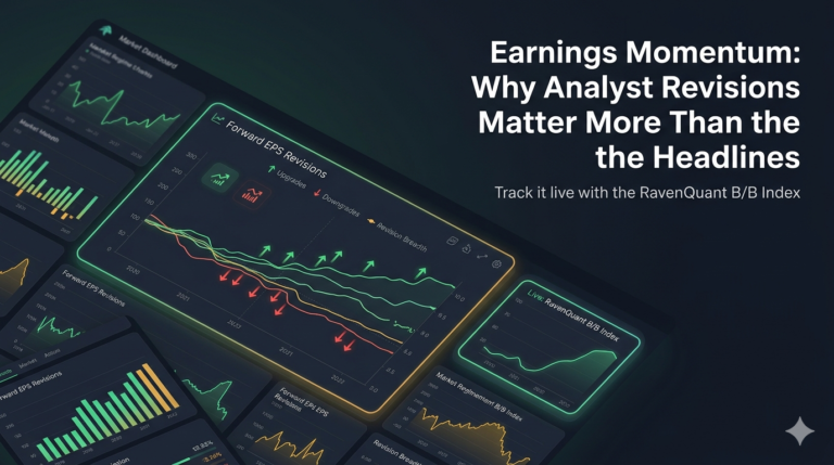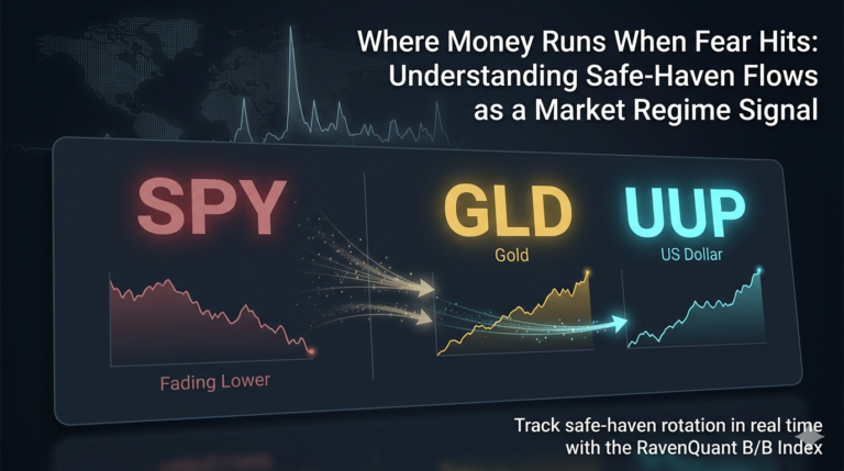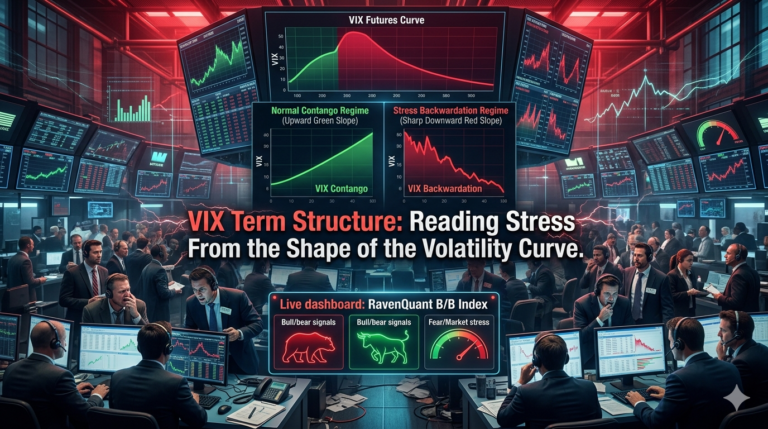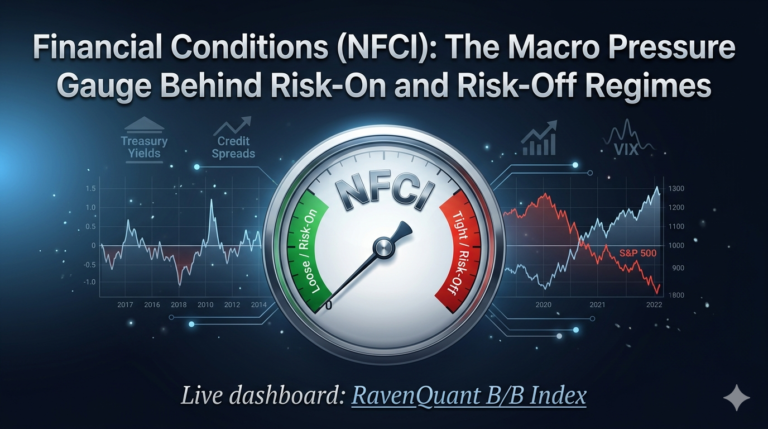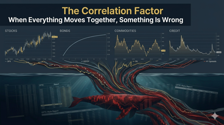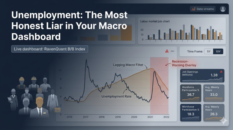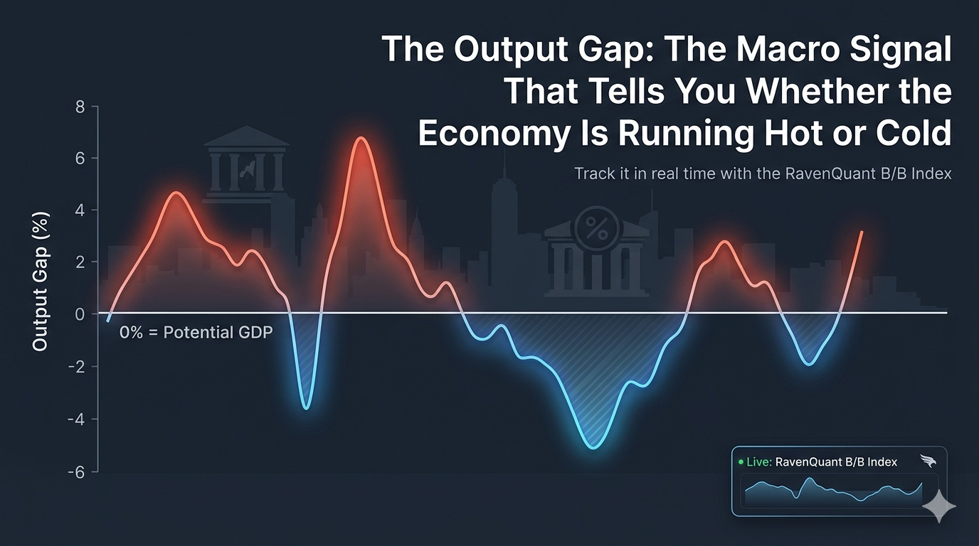
Live dashboard: RavenQuant B/B Index
There’s a concept that shows up in almost every serious macroeconomic framework, yet most retail investors have never heard of it. The output gap — the difference between what an economy is actually producing and what it theoretically could produce at full capacity — sounds academic until you realize that it quietly explains why the Fed raises rates, why inflation showed up when it did in 2021, and why markets behaved so strangely after the 2008 crisis.
The formula is simple: 100 × (Real GDP − Potential GDP) / Potential GDP. Real GDP (GDPC1) is the Bureau of Economic Analysis’s inflation-adjusted measure of everything the U.S. economy produced. Potential GDP (GDPPOT) is the Congressional Budget Office’s estimate of what the economy could produce if it were running at a sustainable full-employment level — no overheating, no excessive slack. Both series are freely available on the Federal Reserve’s FRED database.
What the Output Gap Says About Inflation Pressure
Think of it like a car engine with a redline. You can push the RPMs above it for a while, but something eventually gives out. A positive output gap means the economy is running above its sustainable potential — factories are humming over capacity, labor markets are tighter than they should be, and businesses can charge more because demand is everywhere. That’s the overheating scenario. A negative output gap is the opposite: the engine is idling. There’s spare capacity, workers who can’t find jobs, and downward pressure on prices and wages.
Neither state is inherently catastrophic, but both have predictable downstream effects that matter for investors. When the gap is significantly positive, inflation risk rises, and the Federal Reserve tends to tighten monetary policy to cool things down. When it’s deeply negative, there’s room for stimulus — both fiscal and monetary — without immediately triggering price pressures.
How to Read Expansion, Overheating, and Contraction Regimes
The post-COVID period is the clearest modern case study. Between the fiscal stimulus packages and the reopening demand surge, real GDP temporarily pushed above the CBO’s potential GDP estimate, generating a meaningfully positive output gap by late 2021. This wasn’t the only cause of the inflation spike — supply chains, energy prices, and labor market disruptions all played roles — but running an economy above its productive capacity while simultaneously flooding it with liquidity was a genuinely combustible combination.
The Fed’s delayed response to that positive gap, and subsequent aggressive tightening when it finally moved in 2022, is one of the more consequential policy sequences in recent memory. For investors watching the macro backdrop, the output gap was signaling stress well before the headlines caught up.
Post-2008 Case Study: Deep Slack and Easy Policy
Flip the lens to the post-2008 period. The 2008–2009 financial crisis drove a deeply negative output gap that persisted for years. U.S. real GDP fell far below potential and didn’t recover to it until well into the 2010s. The Fed held rates near zero from late 2008 through 2015 in part because there was so much slack in the economy — so much room to grow before overheating became a concern. For equity markets, that prolonged period of ultra-accommodative policy was a sustained tailwind.
Understanding the output gap helps explain why the Fed kept rates at zero for so long after 2009, not just that it did. It was responding to a real signal about the state of productive capacity utilization in the economy.
For equity investors, the output gap has direct implications that go beyond the Fed. A positive gap generally corresponds to strong corporate revenue — when the economy is running above capacity, consumers and businesses are spending freely, and top-line growth follows. But that same environment raises the cost of labor and inputs, compresses margins, and eventually invites the Fed’s intervention. The positive-gap-to-inflation-to-rate-hike transmission mechanism that played out in 2022 wasn’t a surprise to anyone watching the macro data closely; it was a fairly logical sequence.
Conversely, a negative gap is associated with weaker revenues but also lower borrowing costs, potential fiscal stimulus, and the kind of low-rate environment that supports equity valuations through discount rate compression. Neither is permanently bullish or bearish — context always matters.
What the output gap gives you is a structural backdrop read: is the economy running hot, cold, or in between?
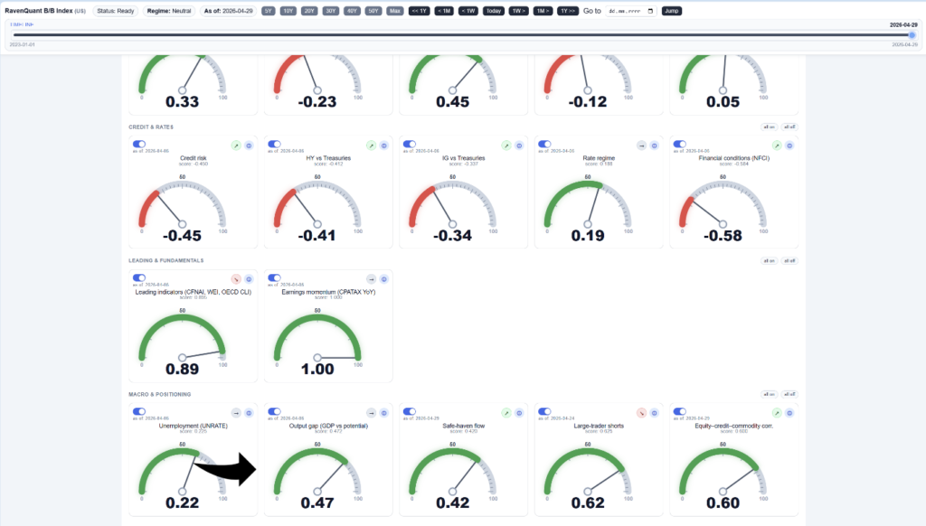
How RavenQuant Integrates the Output Gap in Real Life
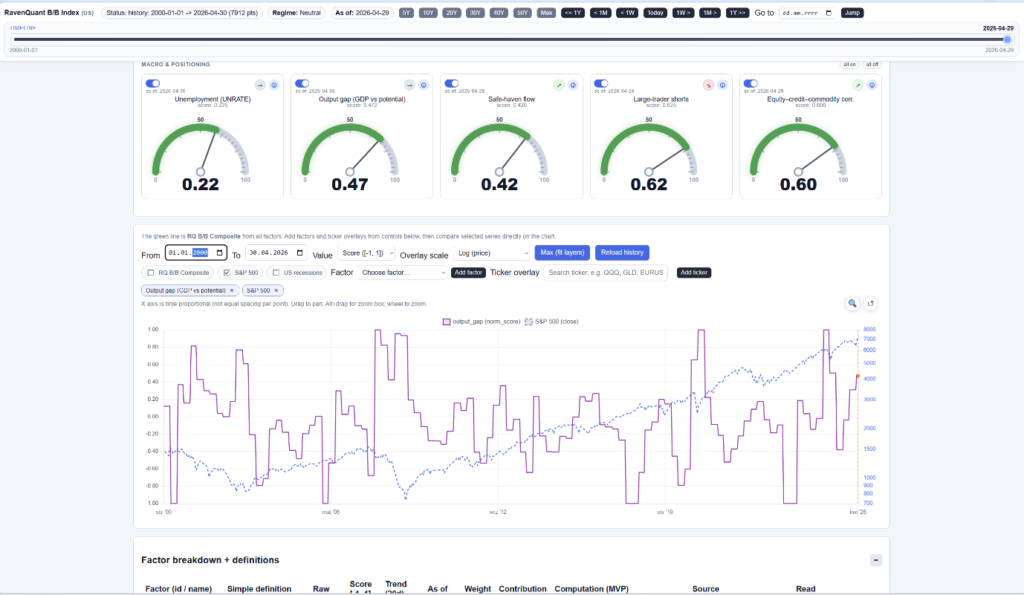
In the live RavenQuant B/B Index, the output gap is used as a slow regime input rather than a short-term trading trigger. A widening negative gap that starts to close is treated as an improving growth backdrop, while an extreme and accelerating positive gap is treated as late-cycle overheating risk because it often precedes tighter Fed policy. This way, the signal is integrated directly into risk-on/risk-off scoring and helps position sizing stay aligned with macro conditions.
Here’s where honesty matters. The output gap has two serious practical limitations. First, it’s quarterly data — you’re working with a reading that may be three to six months old by the time you see it. Second, and more importantly, both real GDP and potential GDP get revised heavily. The CBO regularly revises its GDPPOT estimates as its methodology and assumptions evolve. It’s entirely possible to think you’re in a positive gap based on preliminary data and later learn the actual figure was different.
This is a slow-moving macro backdrop signal best used to understand the broad regime rather than time specific trades. When it’s positive and rising, treat it as a yellow flag for policy risk even if markets are still climbing. When it’s negative and widening, it suggests a macro environment where stimulus is more likely than tightening.
The underlying FRED data is freely accessible at fred.stlouisfed.org/series/GDPC1 and fred.stlouisfed.org/series/GDPPOT for anyone who wants to track it independently.
Explore the live index here: https://bull-bear-analyzer-production.up.railway.app