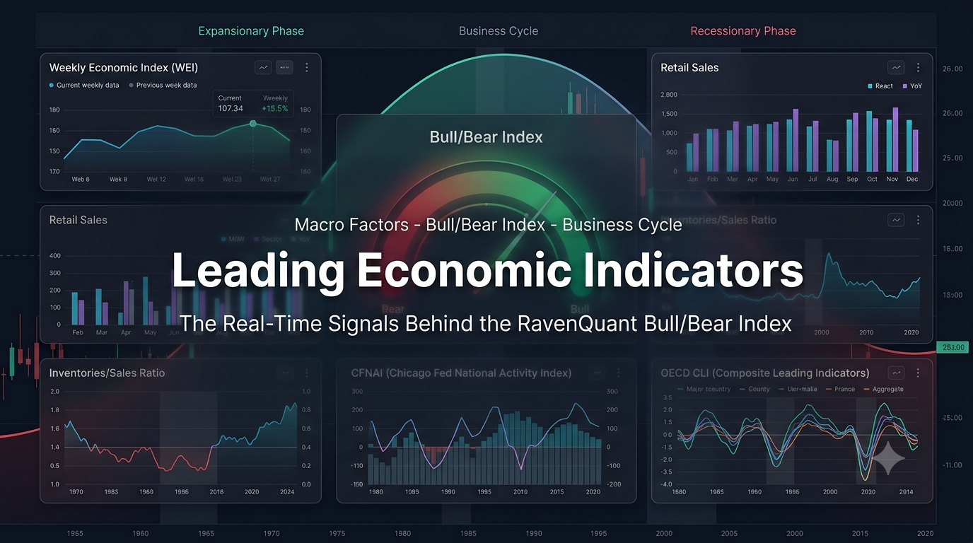
Leading Economic Indicators: The Real-Time Signals Behind the RavenQuant Bull/Bear Index
Most of the economic data you read about in the news is a rearview mirror. GDP lands weeks after the quarter is already over. The jobs report measures last month. Even the “flash” surveys are just a faster look at what already happened. When I built the macro side of the RavenQuant Bull/Bear Index, I wanted the opposite: a set of leading economic indicators that try to tell you where the cycle is heading, not where it has been. That is the whole point of a forward-looking factor. If your regime model only reacts after the recession is confirmed, you are trading yesterday’s news.
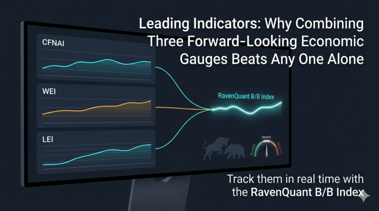
The problem is that no single leading indicator is trustworthy on its own. Each one has a blind spot, a noisy patch, or a lag somewhere. So instead of betting everything on one series, the Leading Indicators subcomposite blends five different forward-looking gauges that update at different speeds and cover different parts of the economy. In this article I want to walk through every one of them, explain how they roll up into the Bull/Bear Index, and show you exactly why each piece earns its place as a genuinely leading signal.

What are leading economic indicators?
Economists sort business cycle data into three buckets, and knowing the difference is the whole game. Lagging indicators confirm a trend after it has already turned: think unemployment rate, corporate profits, or the average duration of unemployment. Coincident indicators move roughly in step with the economy right now: industrial production, personal income, real GDP. Leading economic indicators are the ones that tend to peak and trough before the broad economy does. They are the early warning system.
The reason leading indicators lead is usually structural, not magic. Businesses cut hours before they cut headcount. They stop restocking shelves before they lay people off. Freight volumes soften before factories go quiet. Consumers trim discretionary spending before the official data catches it. Each of these behaviors shows up in a measurable series weeks or months ahead of the coincident data. A good leading indicator captures one of these behaviors cleanly and early.
How the Bull/Bear Index uses these leading economic indicators
Inside the Bull/Bear Index, these five series do not each get their own vote in the top-level score. They first roll up into a single Leading Indicators subcomposite. Each series is normalized so that wildly different units (a GDP-scaled growth rate, an index level near 100, a ratio, a diffusion index) can be compared on the same footing. The normalized series are then blended into one forward-looking factor score.
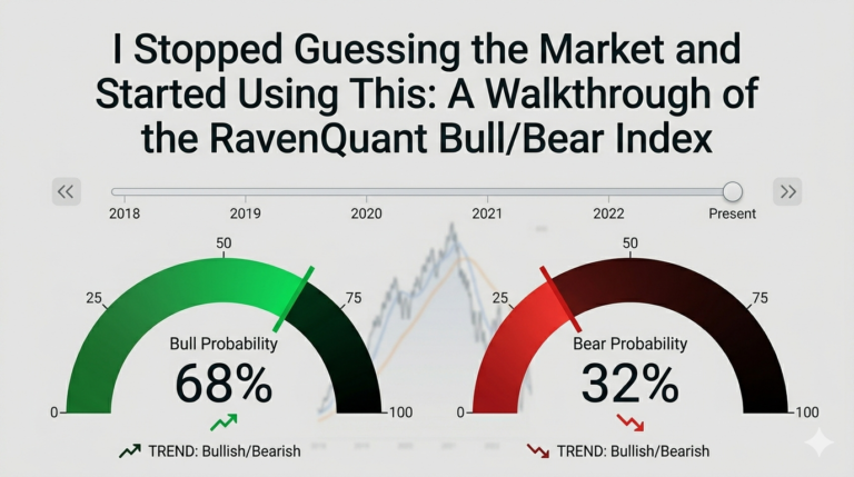
That subcomposite is then read two ways. The first is the level: is the combined signal above or below its historical neutral zone? The second, and often more useful, is the 20-day trend direction: which way is the whole bundle moving right now? Around a turning point, the direction of change frequently matters more than the absolute level. A still-positive reading that has been falling hard for three weeks is a very different message than a positive reading that is climbing. If you want to see this factor update live alongside the other regime inputs, it sits in the RavenQuant Bull/Bear Index dashboard. This is the same systematic, rules-based philosophy we apply to trade research like our S&P 500 contrarian strategy: define the signal clearly, then let the data speak.
How to open the Leading Indicators popup and read it
You do not have to take any of this on faith. In the RavenQuant Bull/Bear Index dashboard, the Leading Indicators factor is clickable. Select it and a detail popup opens showing exactly how the subcomposite is built, right down to every raw input and its release date. It is the fastest way to see whether the forward-looking signal is being driven by one series or by all of them at once.
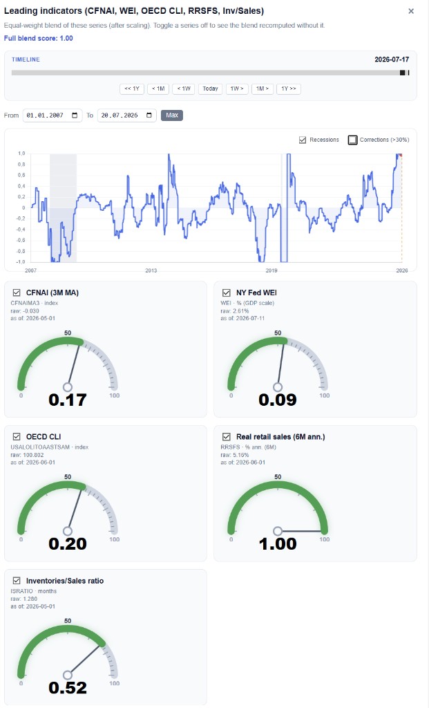
Here is how to read what pops up, top to bottom:
- The blend score. At the very top you get the full blend score, an equal-weight combination of the five series after each one has been scaled to a common range. This single number is what feeds the higher-level regime read.
- Toggle any series on or off. Each of the five cards has a checkbox. Untick one and the blend instantly recomputes without it, so you can see how much any single series (say the WEI, or the inventories/sales ratio) is actually moving the result. It is a quick sensitivity check.
- The historical chart. The line plots the blend through time, here from 2007 to the present, with recessions shaded and an optional overlay for market corrections greater than 30%. The timeline slider and the From/To/Max controls let you scrub to any window you want.
- The five gauges. Below the chart, each series gets its own dial: CFNAI (3M MA), NY Fed WEI, OECD CLI, real retail sales (6-month annualized), and the inventories/sales ratio. Every card lists the underlying source series, its raw reading, and the “as of” date, so you can see at a glance which inputs are fresh and which are running on last month’s data.
That last point is where the popup earns its keep. Because the release dates sit right on each card, you can immediately tell that the weekly WEI is days old while the monthly CFNAI or OECD CLI might be a few weeks behind. Seeing the raw values next to the scaled gauge readings is also the clearest way to understand what the subcomposite is really made of, which is exactly what the rest of this article breaks down series by series.
The Weekly Economic Index (WEI) and its 10 components
The Weekly Economic Index is the fast heartbeat of the whole subcomposite. It was developed by Daniel Lewis, Karel Mertens, and James Stock, and is now published by the Federal Reserve Bank of Dallas. It blends ten daily and weekly series into a single number that is scaled to the four-quarter GDP growth rate. In plain terms: if the WEI reads 2.5, and it stayed there for a full quarter, you would expect GDP that quarter to run about 2.5% above the year-ago level. It speaks the same language as GDP, but it updates every single week instead of once a quarter.
Its 2020 debut made the case better than any backtest could. When lockdowns hit in mid-March 2020, the WEI collapsed within days, capturing the cliff-edge in near real time while the monthly data took weeks to catch up. That weekly velocity is exactly why it anchors the subcomposite. The ten components split cleanly into three groups: consumer, labor, and industrial. Here is what each one is and why it leads.
The ten components split cleanly into three families: two consumer series, four labor market series, and four industrial series. Each one is expressed as a year-over-year percentage change, so the whole index reads in the same GDP-comparable units. Here is a full breakdown of what each component measures, what it actually tells you, and why it earns its place as a genuinely leading signal.
Consumer components: the first flinch in demand
1. Redbook same-store sales. This is a weekly read on year-over-year sales growth at a large sample of US general merchandise retailers and chain stores, published every Tuesday. The “same-store” part matters: it only counts stores open at least a year, which strips out the noise of new openings and closings and isolates genuine underlying demand. What it tells you is simple and immediate, namely how much households are actually ringing up at the register this week rather than a month ago. It leads because discretionary retail is one of the first things people throttle when money gets tight. A sustained slide in Redbook usually appears before it lands in the official monthly retail sales report, and well before it filters into consumption inside GDP.
2. Rasmussen Consumer Index. This is a daily survey-based gauge of US consumer confidence, tracking how people feel about their own finances and the broader economy on a rolling basis. Because it refreshes daily, it registers shifts in mood almost instantly, ahead of the better-known monthly confidence surveys from the Conference Board or the University of Michigan. The reason it leads is behavioral: sentiment moves before spending. When confidence cracks, households tend to postpone big purchases and quietly build a savings cushion for a while before the pullback shows up in hard spending numbers. Day to day it is noisy, but the direction of its trend is an early read on the consumer’s willingness to open the wallet.
Labor market components: hours before headcount
3. New (initial) jobless claims. This counts the people filing for unemployment benefits for the first time each week, reported every Thursday. It is the fastest and cleanest read on layoffs in the entire US data set. A rising four-week trend off a low base is one of the most reliable early recession signals there is, because employers freeze new hiring and begin layoffs before the unemployment rate, a classic lagging indicator, actually climbs. When initial claims start grinding higher, the labor market is deteriorating in real time, not in hindsight.
4. Continued jobless claims. This measures the people who stay on unemployment benefits after that first filing, reported with a one-week lag to initial claims. Where initial claims capture the pace of new layoffs, continued claims capture how hard it is for those already out of work to find a new job. That distinction is the useful part: rising continued claims while initial claims are still low is a quiet warning that hiring is freezing even though firing has not accelerated. Read together, the two claims series map both sides of the labor market flow, people leaving jobs and people struggling to re-enter.
5. Adjusted income and employment tax withholdings. This is a smoothed, tax-law-adjusted measure of federal income and payroll taxes withheld from paychecks, compiled by Booth Financial Consulting. It is powerful because it captures the intensive margin of work, not just the extensive margin. Claims tell you how many people have jobs; withholdings tell you how many hours those people are working and how much they are being paid, since taxes are withheld on actual wages, overtime, and bonuses. Employers usually trim overtime, cut hours, and slow raises before they resort to outright layoffs, and withholdings soften first when that happens. It is effectively a near-real-time read on total labor income flowing through the economy.
6. American Staffing Association Staffing Index. This is a weekly index of temporary and contract staffing employment across the US. Temp workers are the shock absorber of the labor market, the first hired when demand picks up and the first cut when it fades, because they are the cheapest and easiest headcount to add or drop. That makes the ASA index one of the purest leading labor signals available. A rolling decline in temp staffing frequently precedes weakness in permanent payrolls by weeks or even months, so it acts as an early tremor before the main employment quake.
Industrial components: the physical pulse of production

7. Railroad traffic originated. These are weekly carload and intermodal volumes from the Association of American Railroads, measuring the physical movement of raw materials, components, and finished goods across the country. Freight is an input to production and distribution, so it moves ahead of the output it enables. When manufacturers and retailers anticipate softer demand, they order fewer inputs and ship less, and rail volumes fade before the slowdown shows up as a drop in industrial production or GDP. It is a tangible, hard-to-fake gauge of goods activity in motion.
8. Raw steel production. This is weekly US raw steel output, an intermediate input feeding manufacturing, construction, autos, machinery, and appliances. Because steel sits so far upstream of finished production, changes in steel output tend to lead changes in the finished goods that consume it. When producers expect to build fewer cars or break ground on fewer projects, they cut steel orders first, so a falling trend in steel output and capacity utilization is an early industrial warning. It is one of the oldest heavy-industry tells in the book precisely because so much downstream activity depends on it.
9. Wholesale sales of gasoline, diesel, and jet fuel. These are near-real-time fuel distribution volumes, and each fuel maps to a different slice of activity. Diesel tracks trucking and freight, gasoline tracks commuting and consumer travel, and jet fuel tracks air travel and business trips. Taken together they are a proxy for the physical movement of the whole economy. When freight and travel slow, fuel demand softens quickly, usually before the slowdown surfaces in the monthly data, which makes fuel sales an energy-based read on real-economy motion in close to real time.
10. Weekly average US electricity load. This is total electricity demand across the grid, averaged weekly. Factories, offices, data centers, and homes all draw power in rough proportion to how hard the economy is running. When industrial activity slows, plants run fewer shifts and pull less load, so electricity demand works as a high-frequency proxy for real-time output. It updates weekly and is genuinely difficult to distort, which is exactly what you want in a leading signal.
Step back and the design logic is clear. The four industrial series (rail, steel, fuel, electricity) are all inputs to economic activity, not the finished result, so they bend before the output that GDP eventually measures. The two consumer series and four labor series do the same job on the demand side, catching the exact moment households and employers change their behavior. The one honest weakness of the WEI is noise: weekly data is choppy, and a single holiday, storm, or one-off strike can jerk it around for a week. That is precisely why it is never used alone, and why it is blended with the slower, deeper series that follow.
Retail sales: near-real-time consumer spending
Consumer spending is roughly two-thirds of the US economy, so any early read on it is gold. The retail sales input is designed to be a near-real-time measure of spending, and it behaves a lot like the private card-spending trackers, most notably the Bank of America card spending index, which aggregates anonymized debit and credit transactions across millions of accounts.

The value here is timing and honesty. Traditional retail data arrives with a lag and gets revised. A near-real-time spending series, by contrast, is measuring transactions as they happen. When households start pulling back, discretionary categories soften first, and a high-frequency spending read catches that shift well before the smoothed, revised, official number confirms it. In a regime model, that head start is the entire point. It tells you the demand side is weakening while the coincident data still looks fine.
Inventories/sales ratio: the quiet leading indicator
The inventories/sales ratio is the least glamorous series in the bundle and one of the most underrated. It simply divides the dollar value of business inventories by monthly sales. The result answers a blunt question: how many months would it take to clear the shelves at the current pace of selling? A low ratio means goods are flying off the shelves relative to what is stocked. A high and rising ratio means inventory is piling up faster than it is being sold.
Here is why it leads rather than lags. When the ratio climbs, it usually means sales have slowed while orders that were placed months ago are still arriving. Businesses do not sit on that. They respond by cutting new orders and trimming production to work down the excess stock, and those production cuts ripple into hours, hiring, and freight in the months that follow. So a rising inventories/sales ratio is often an early tell that a production slowdown is coming, even while current output still looks healthy. The mirror image is just as useful: when the ratio falls sharply, businesses have to ramp production to restock, which front-runs a recovery. The classic “inventory cycle” is one of the oldest and most reliable rhythms in the whole economy.
Chicago Fed National Activity Index (CFNAI)
If the WEI is the fast heartbeat, the Chicago Fed National Activity Index is the deep, broad reading. The Chicago Fed builds it from 85 monthly indicators spanning production and income, the labor market, personal consumption and housing, and sales, orders, and inventories. It is scaled so that a reading of zero equals the historical trend growth rate of the US economy. Positive means above-trend growth, negative means below-trend.
The number to watch is the three-month moving average, the CFNAI-MA3. When it drops below -0.70 following an expansion, it has historically signaled a rising probability that a recession has already begun. During the 2008-2009 crisis it plunged to some of its most negative readings ever recorded. The strength of the CFNAI is its depth: with 85 underlying series, it is very hard to distort, and it captures activity that any single survey would miss. Its trade-off is timing. It is monthly, so you are always a few weeks behind, and the underlying series get revised. That is exactly the gap the weekly WEI is there to fill, which is why the two sit side by side in the subcomposite.
OECD Composite Leading Indicator (CLI)
The last piece stretches the horizon out the furthest. The OECD Composite Leading Indicator is engineered specifically to anticipate turning points in the business cycle, with a targeted lead of roughly 6 to 9 months. Rather than tracking the level of activity, it tracks fluctuations around the economy’s long-term potential, in other words the growth cycle. It is published monthly, presented in amplitude-adjusted form around a long-term average of 100, so a reading above 100 and rising points to above-trend momentum ahead, while a reading below 100 and falling warns of a slowdown forming.
The OECD selects each component series specifically for its leading properties against the reference cycle, then de-trends, smooths, and normalizes them before combining. The result is qualitative more than quantitative: it is better at flagging that a turn is coming than at pinning down its exact size. That is fine, because it is doing a different job than the WEI or CFNAI. Where the WEI gives you weekly speed and the CFNAI gives you monthly depth, the OECD CLI gives you the longest forward view of the three. Blending all three horizons is what makes the subcomposite robust.
Why combining these leading economic indicators beats any single one
Put the five together and each one covers another’s weakness. The WEI supplies weekly speed but is noisy. The CFNAI supplies depth across 85 series but arrives monthly and gets revised. Near-real-time retail sales isolate the consumer. The inventories/sales ratio front-runs the production cycle. The OECD CLI extends the horizon out six to nine months. When all five point the same way, the regime signal is loud and consistent. When they split, the disagreement itself is worth respecting, and it usually means the subcomposite sits near neutral rather than screaming a call.
This is the same discipline I try to bring to every part of RavenQuant. A regime read on leading indicators pairs naturally with volatility context like the one in our guide to reading the VIX, and it sits upstream of the systematic execution work behind our Nasdaq 100 momentum strategy and our intraday volatility breakout strategy. Macro sets the weather; the strategies decide how to sail in it.
None of this is a crystal ball. Leading indicators shorten the lag between reality and your read on it, but they do not eliminate it, and no factor removes the need for risk management. What they do give you is a fighting chance to see the cycle turn while it is turning, instead of reading about it in a GDP report six weeks later. You can watch the whole Leading Indicators subcomposite update in context inside the RavenQuant Bull/Bear Index.